-
Deep cuts are the latest collectible trend

We’re seeing an increase in what I call deep-cut collectibles: figures based on secondary and even obscure characters, ornaments depicting oddball 1970s models, and screen-accurate recreations of the bridge, among others.
And I am definitely here for all this — even though I may no longer be the ideal customer. Forty years into this journey, I have slowed and focused my collecting, and I now concentrate on vintage 1960s and 1970s items. Having said that, I really want that sweet Nacelle Toys bridge model.
And I applaud these companies for releasing collectibles that are essentially love letters to us.
Deep cuts are not new
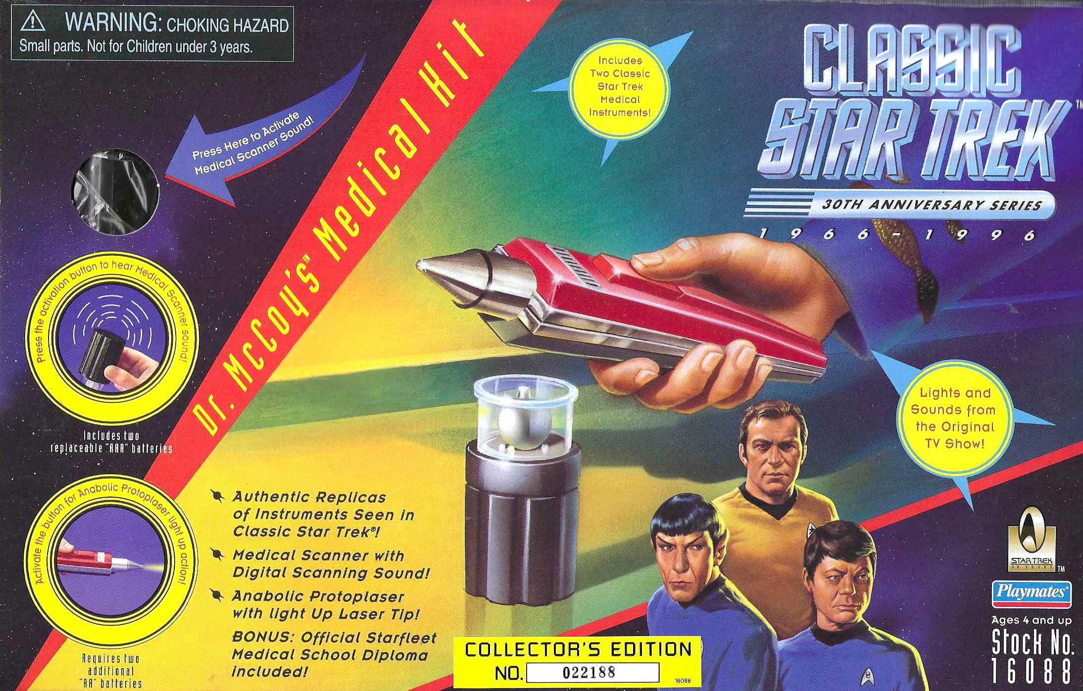
Deep-cut and obscure collectibles have always existed in our fandom. Over the last few decades, we had the Mego Cheron figure, cards signed by seen-once guest stars, the Spock decanter from the Grenadier Spirits Company, the Eaglemoss model of the Jefferies ring-ship design, and the Playmates Dr. McCoy’s Medical Kit, featuring the “Anabolic Protoplaser with light Up Laser Tip!”
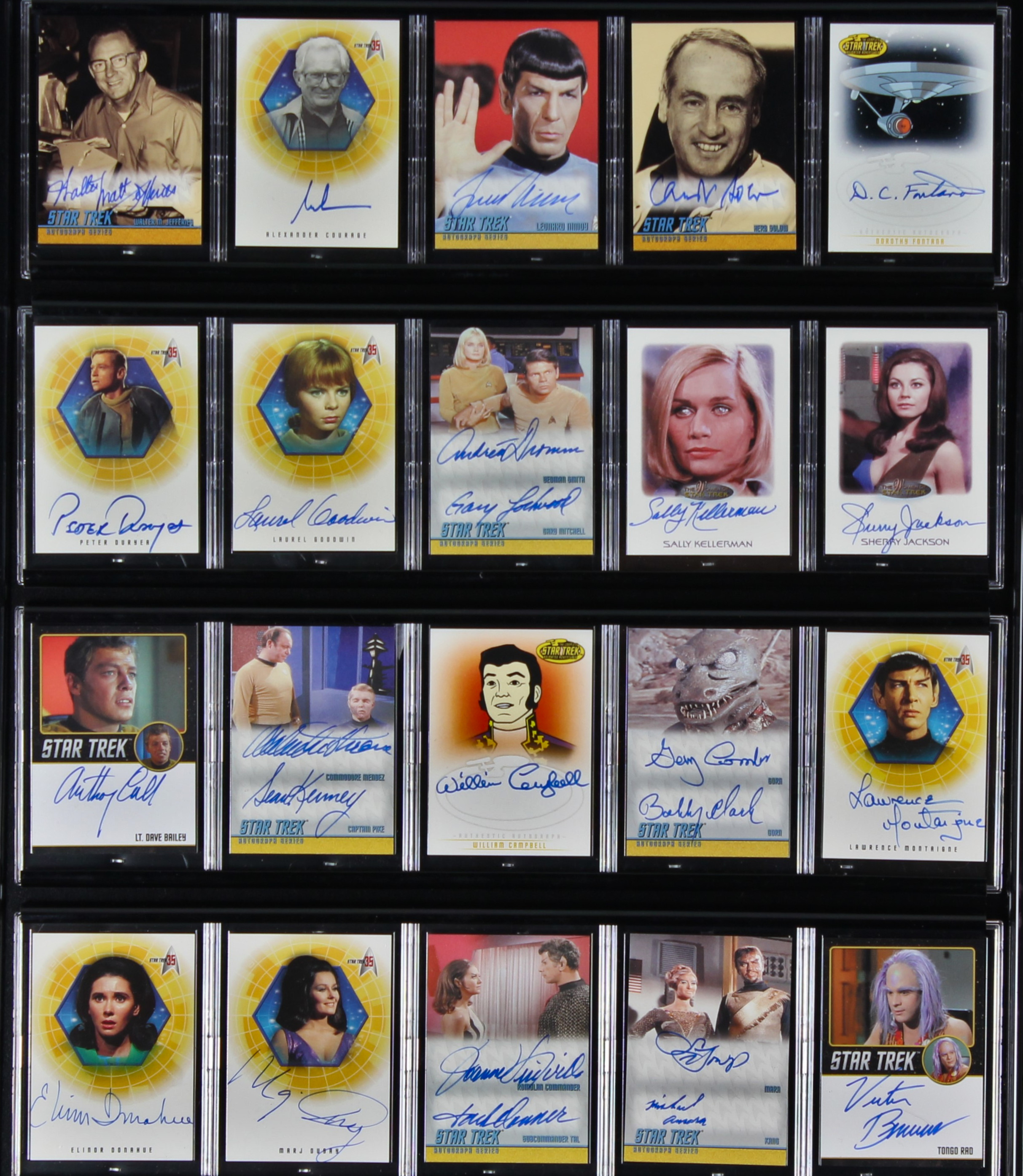


And that list is just from looking around my Star Trek room. There are others.
Celebrating the new deep cuts
So, deep-cut collectibles are not new but I am glad to see the recent uptick in this category.
This TrekNews article rounds up some of the latest obscure figures, including Captain Rachel Garrett from Yesterday’s Enterprise, Tuvix from the actually good Voyager episode of the same name, Peter Preston from Star Trek II, In a Mirror Darkly’s Captain Archer, and others.
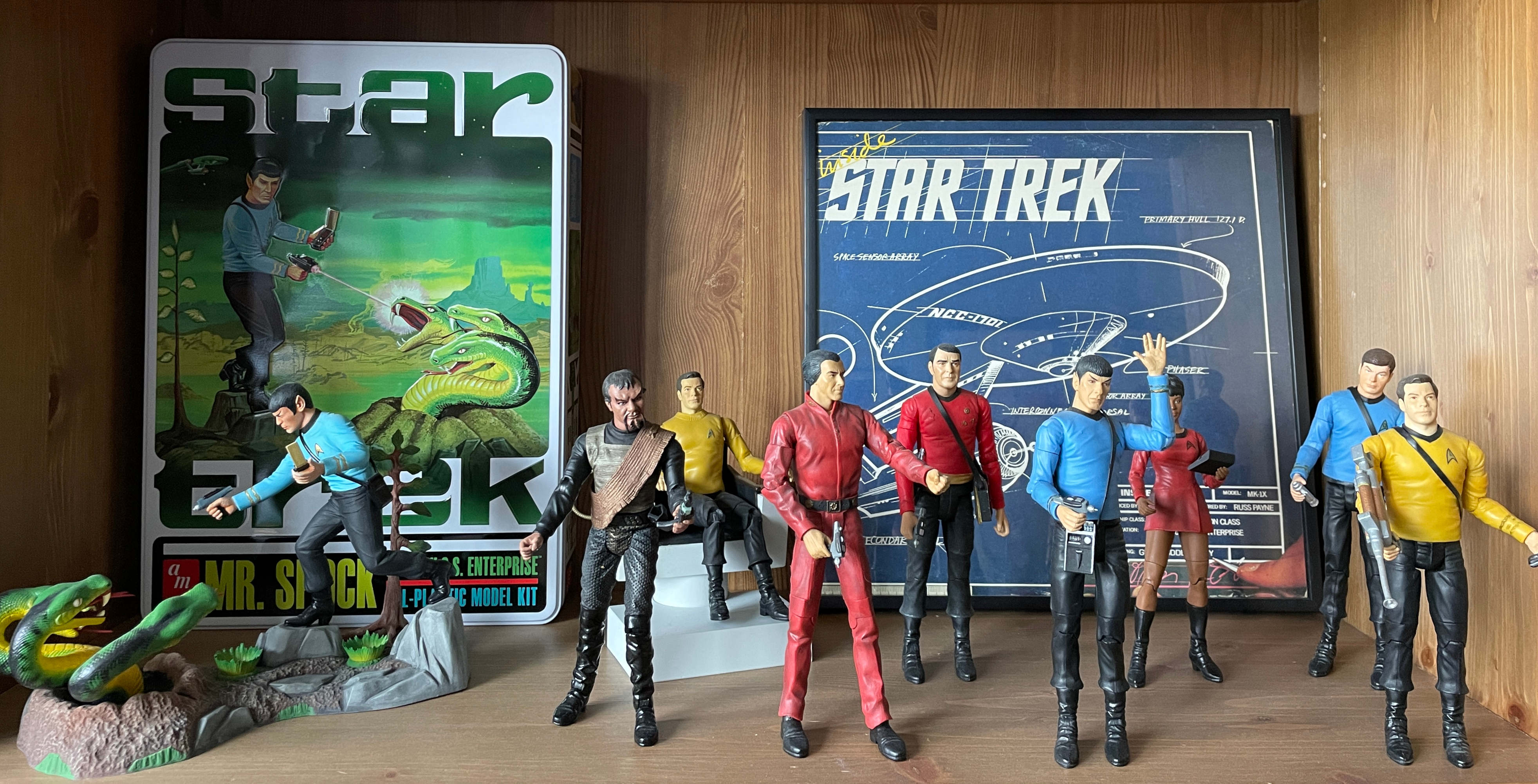
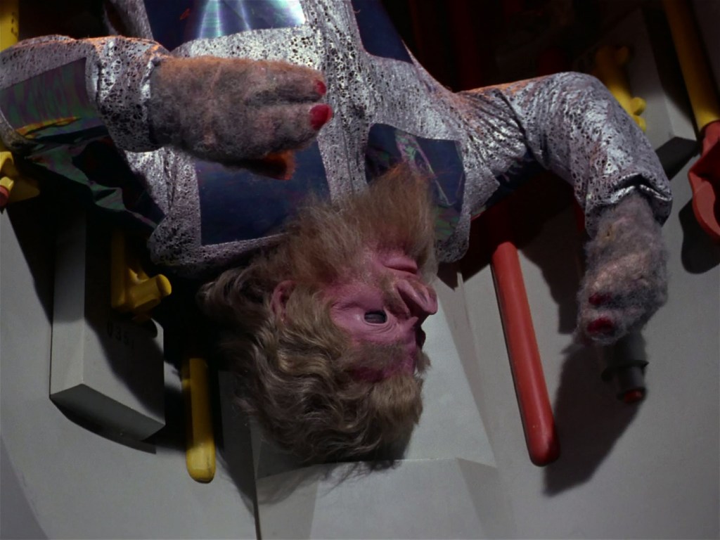
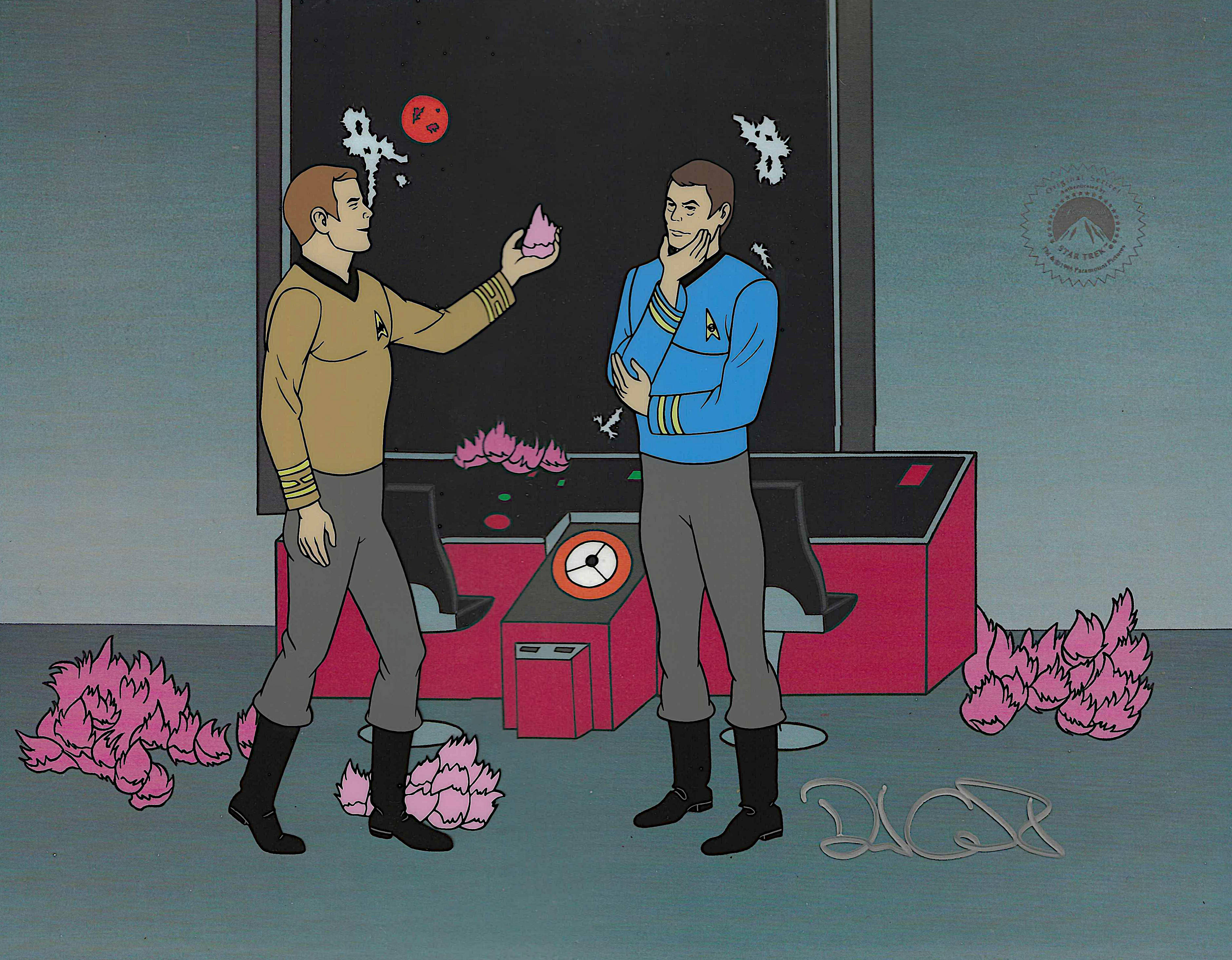
And then there is my favourite recent addition: Hallmark’s tribute to the weirdest of all AMT products, the Spock shooting the three-headed snake model.
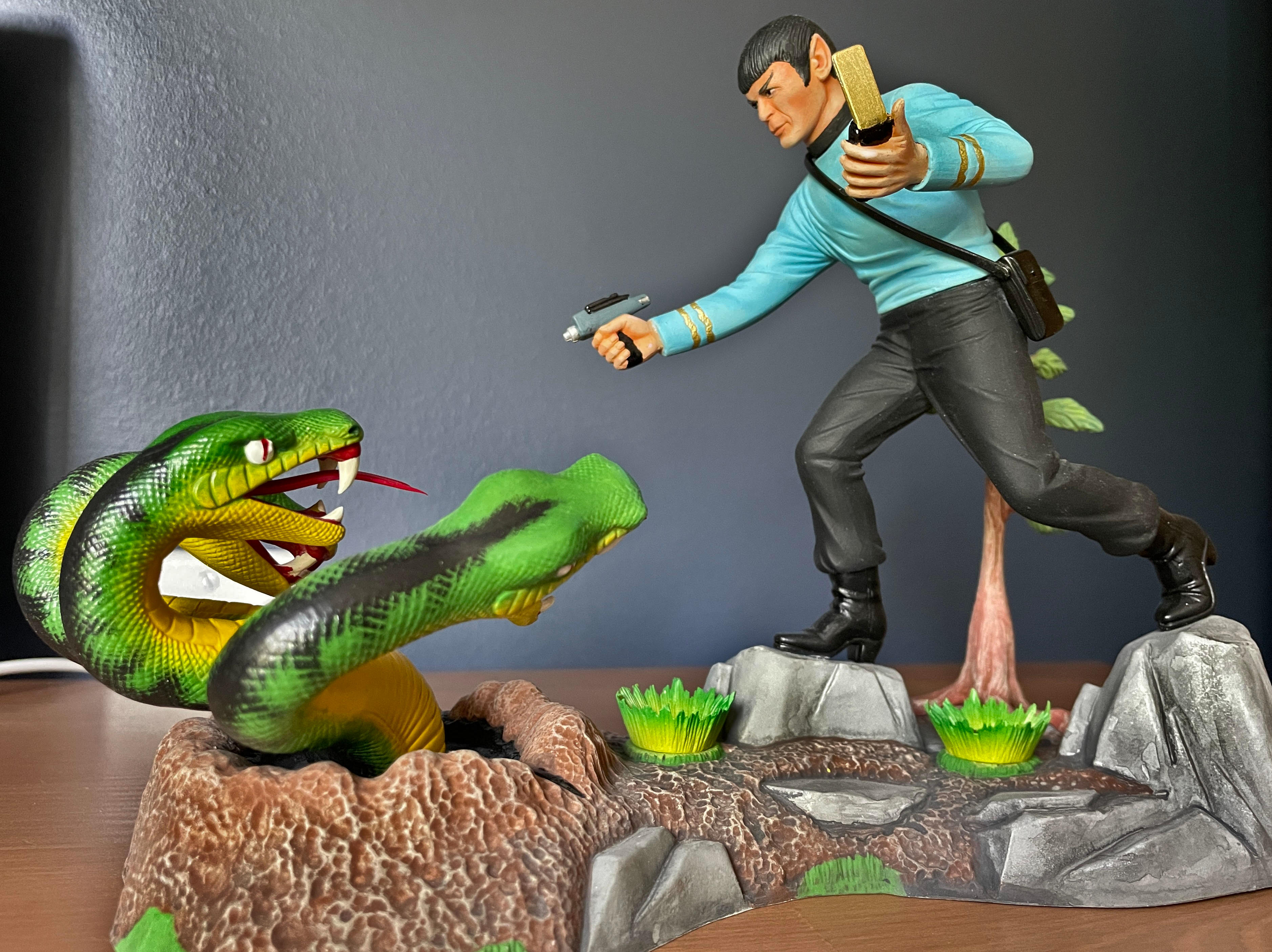

The AMT model and the new Hallmark ornament
I love that model so much that I paid a professional to assemble and paint one for me. (He also did my AMT Enterprise.) I wonder if today’s Hallmark customers will know where this little gem came from.
The 60th anniversary of Star Trek is surely the catalyst for much of this merch activity, but I think licensees are also tapping into a nostalgia for simpler and better times. Spock shooting that snake is not true to Star Trek’s ethos, but it does evoke a time when building models or playing landing party with action figures helped us celebrate these stories.
-
Space challenged? DIY some more display room
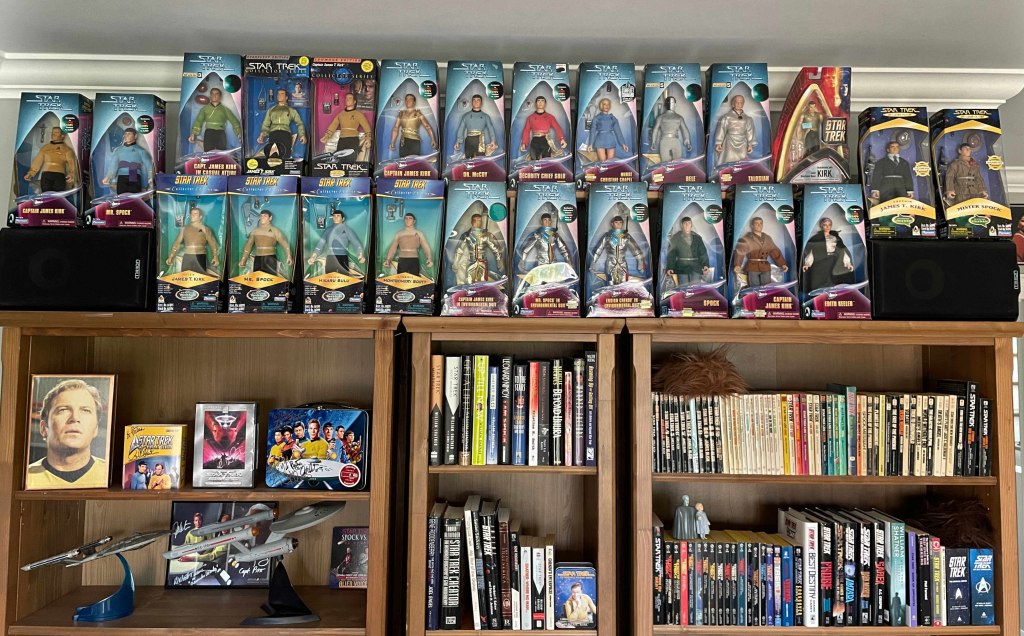
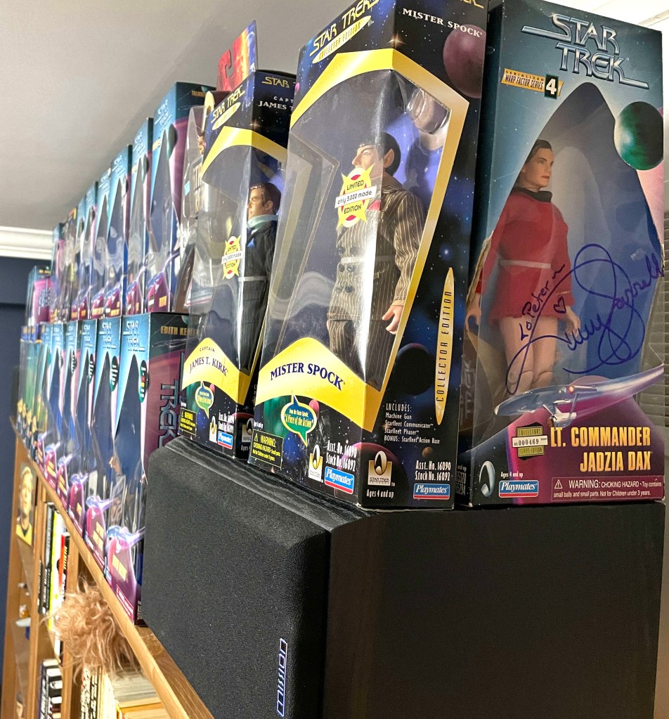
I have a long-standing fondness for the nine-inch TOS Playmates figures. I own 24 of them but, since moving to a smaller Star Trek room last year, I could only display 14. They ran along one row on top of my bookshelves, with the rest piled out of sight behind. Here is the before shot.
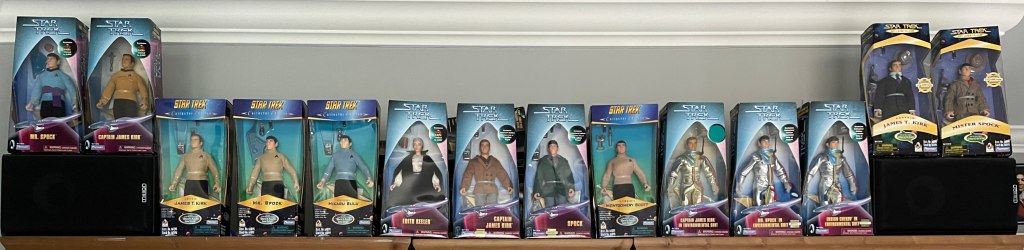
One day, I realized that my high ceiling gave me a fair bit of airspace so, like big cities around the world, I maximized my available real estate by building up.
I built a shelf on legs that sits behind the front row of figures. That may not seem like a big deal: “So…you discovered shelving?” No, but I was inventive in finding more space for a shelf. And it was cheap.
I bought a six foot fence board for $10.21 and an eight foot length of 2×2 for $3.88. I trimmed about six inches off the board, to fit the shelf between my stereo speakers. I chopped the 2×2 into 11-inch legs because the boxes are 12 inches tall, so this would raise the second row to a good viewing height. Wood glue I already owned did the rest.
Total cost, after tax: $15.92.

The new display shows off a large number of figures but still looks neat and organized.
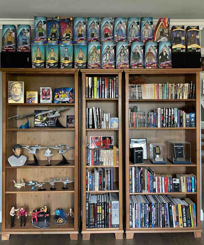
(Did you spot the one Art Asylum figure? It’s over on the right, top row. That Kirk is a placeholder; I’ll swap it out once I pick up one of the 12 TOS nine-inch figures I do not own. And then what will I do when I buy another after that? No idea.)
Lots of collectors are challenged for space, and I am a big believer in displaying as much of your stuff as possible. So, look up by the ceiling and over doorways. Buy a cabinet that suits your items. Consider putting some items behind others — but don’t overdo that: it is easy to slide into a cluttered look.
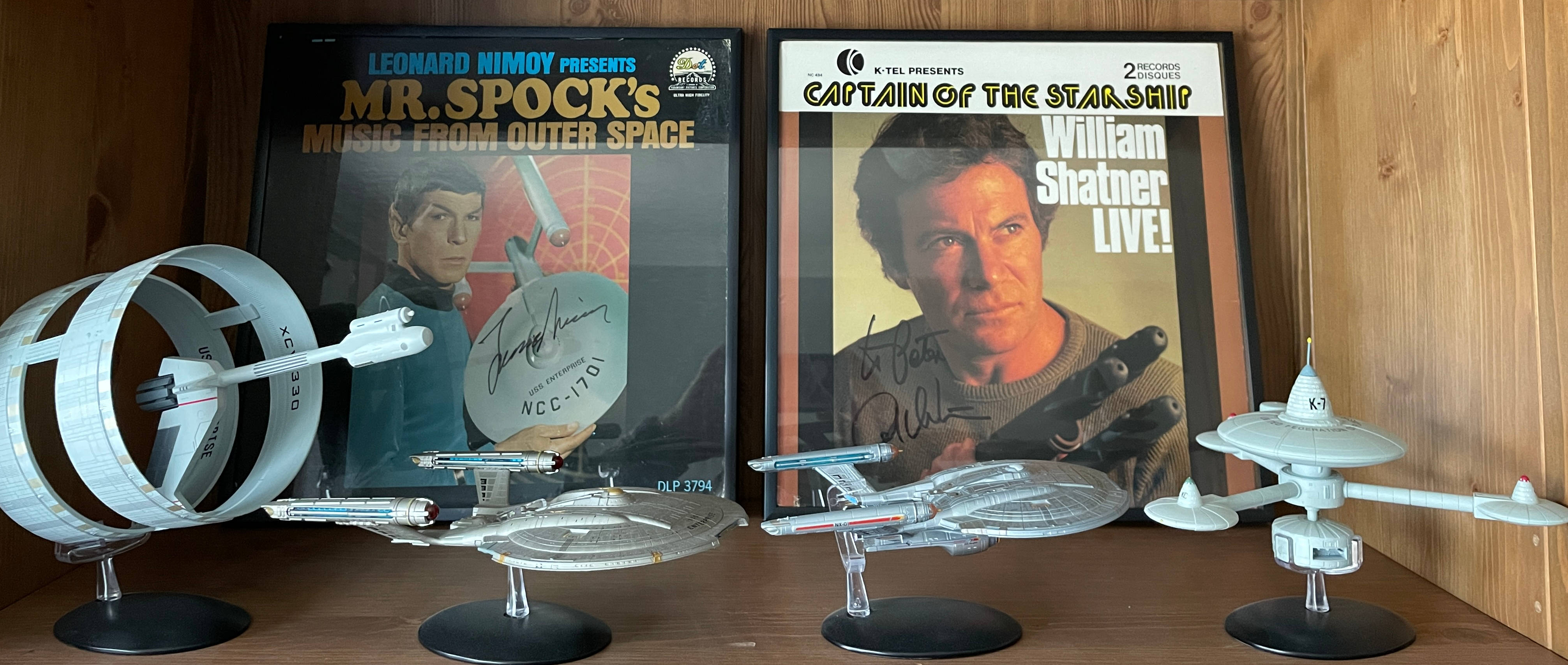
I even perched my signed Trials and Tribble-ations Dax figure on top of the speaker around one corner. Again, maximizing space. Now if only I could come up with such an easy solution for the bridge set I want but have no room for.
That’s a problem for another day. This morning, when I walked into my Star Trek room to review this post, my eyes went first to my new display. It made me happy.
-
This 1978 Nimoy newsletter was the Internet of the ’70s
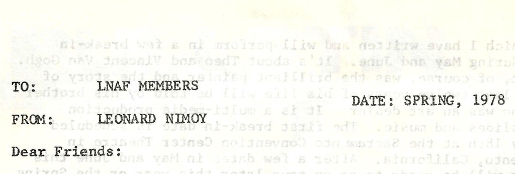
Leonard Nimoy needed to tell fans about his new movie, new play, new book of poetry, new cassette, and that, yes, he would be in the upcoming Star Trek: The Motion Picture.
Today, this would be done on Bluesky, Facebook, and Stephen Colbert’s The Late Show, but 50 years ago those updates came to fans in a stapled and folded newsletter from the Leonard Nimoy Association of Fans for $4 (US) per year.
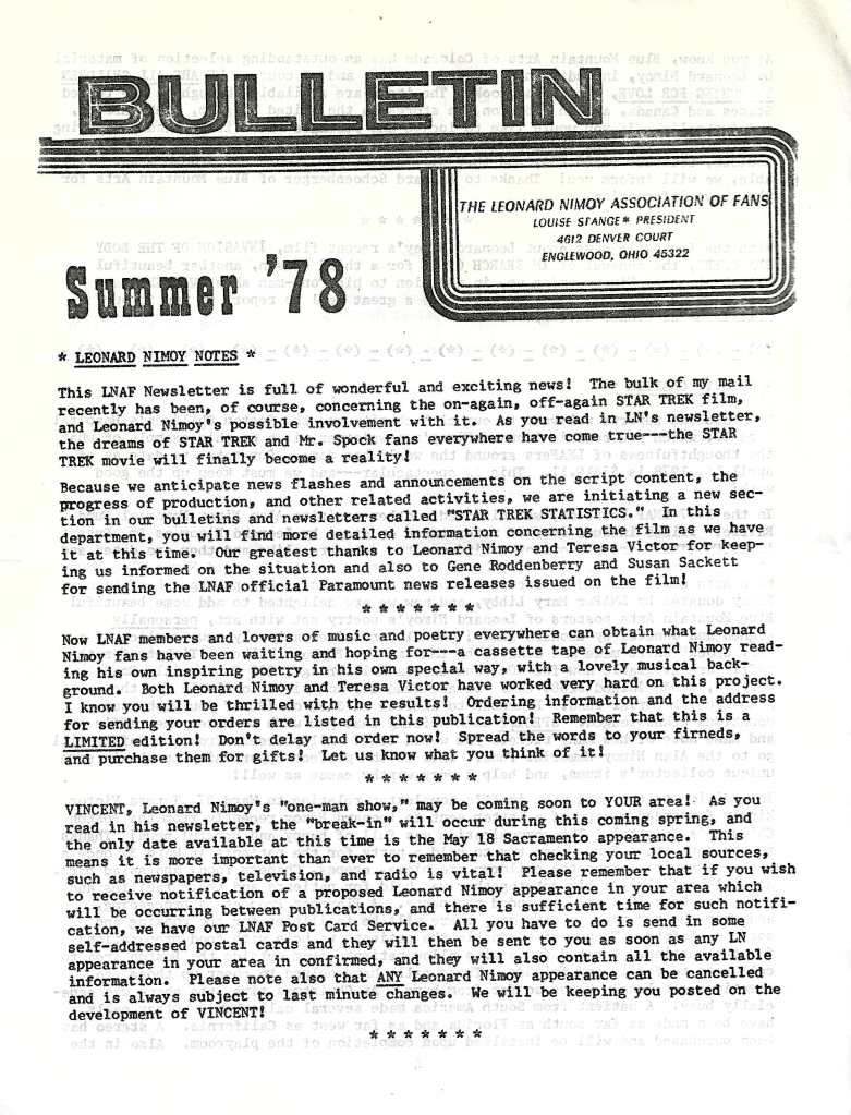
The Spring 1978 newsletter was produced by LNAF president Louise Stange, and included a letter from Nimoy to his fans. Here is a scan, followed by the highlights.
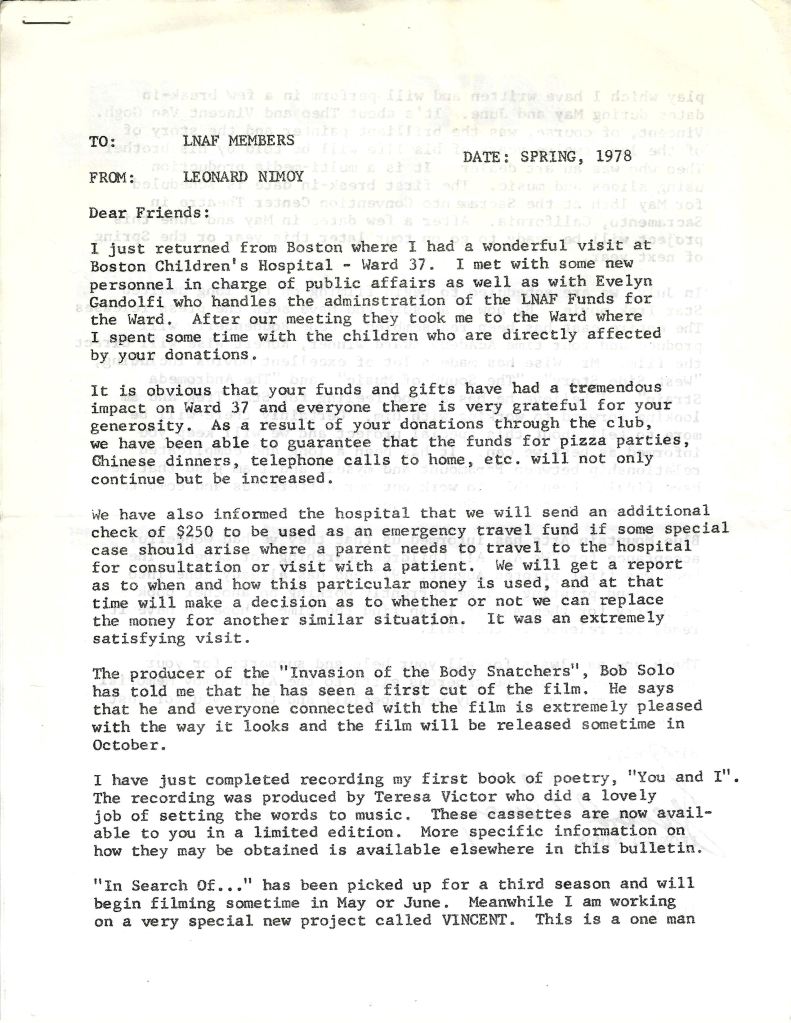
Collecting money for charity. Nimoy wanted his fan club to have a charitable component. The designated recipient had been UNICEF but this changed in 1975, following the 1973 death of Nimoy’s teenaged nephew from cystic fibrosis. Donations were then split between the Alan Nimoy Memorial Fund and the Cystic Fibrosis Foundation. This letter also details Nimoy’s fundraising for the Boston Children’s Hospital.
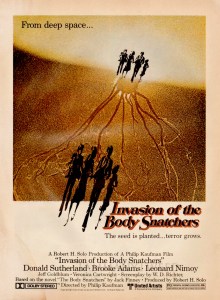
Highlighting Invasion. The best movie featuring a Star Trek star prior to The Motion Picture in 1979 was the remake of Invasion of the Body Snatchers. Nimoy tells readers that the producer, Rob Solo, is pleased with an early cut of the film.
I don’t own the You and I cassette, but now I want to. Promotion was a main function of the fan clubs, and Nimoy wanted it known people could drop some money on his new cassette of poetry reading. That pitch probably worked then and it just worked now. I hit up eBay looking for one. No luck yet.
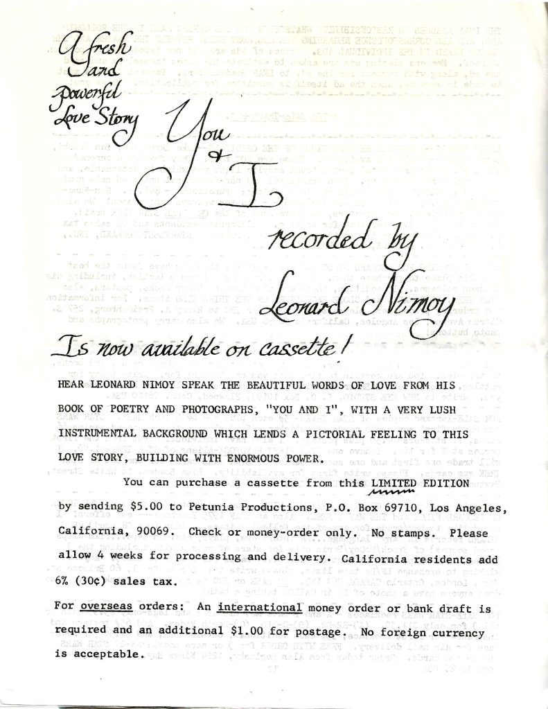
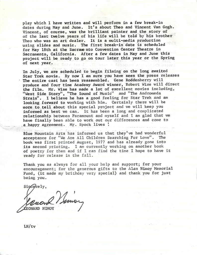
Burying the lede. The big news for fans in the spring of 1978 was that Nimoy had settled his dispute with Paramount and would indeed play Spock again — but that was stuck on the second page, following the important announcement that readers could see a preview of his play Vincent at the Sacramento Convention Center Theatre.
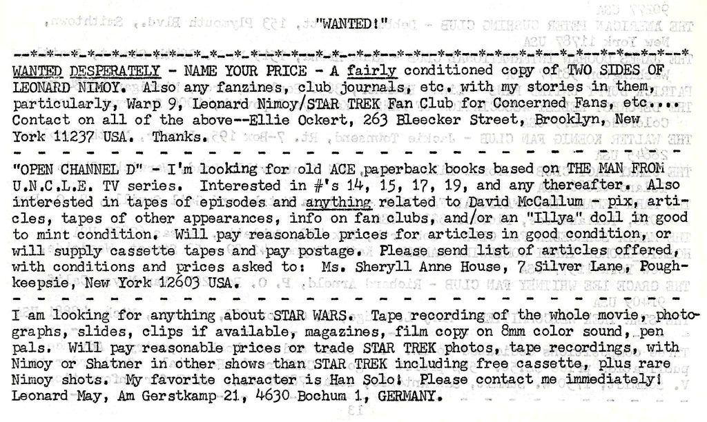
Also, early eBay
These newsletters were also a vehicle for collectibles. There are a couple of pages of people looking to buy or sell. I love Ellie Ockert’s complete lack of negotiating skills when she exclaimed “WANTED DESPERATELY – NAME YOUR PRICE.”
I own a bunch of paper from the LNAF but, like this newsletter until just recently, I have barely glanced through the pile. I will try to share more of this 1970s fandom in the future.
-
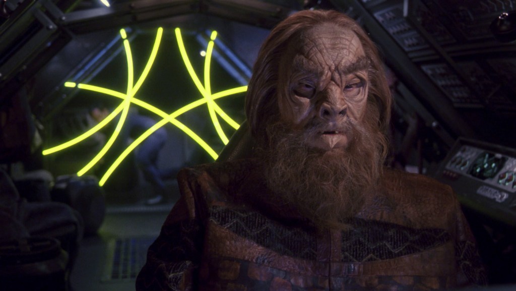
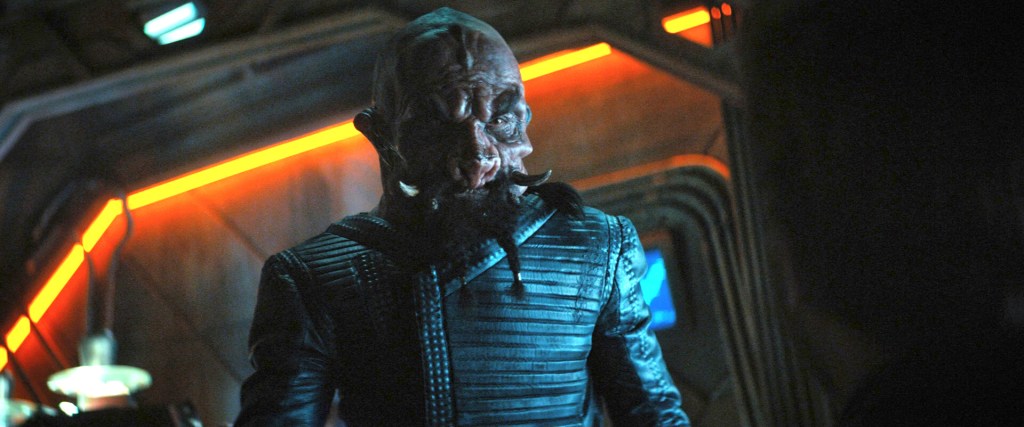
Goodbye, John Wheeler
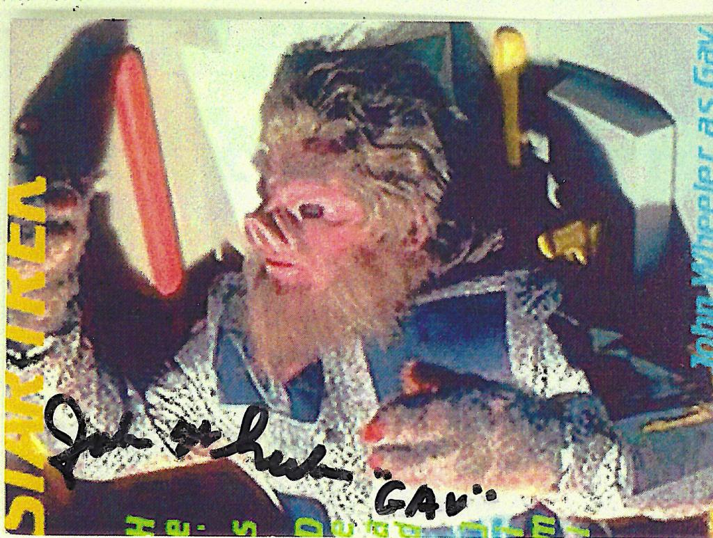
John Wheeler, the actor who helped create the Tellarites, died on February 6, 2026. His passing was made public a few weeks later.
Before his death, all I knew about Wheeler, beyond his appearance as Gav in Journey to Babel, was that he had a sense of humour about himself. Every autograph of his I have seen includes a little joke, often self-deprecating. You can see this in the signed piece of paper I own.
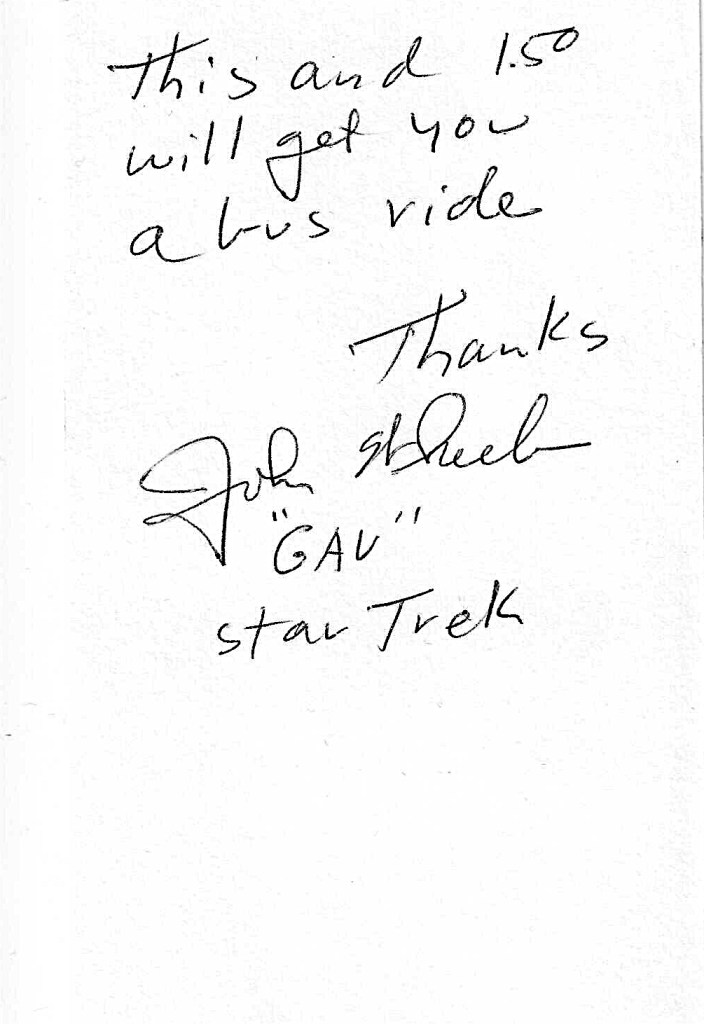
This and 1.50 will get you a bus ride.
Thanks John Wheeler “GAV” Star Trek
I am not sure where or when he signed this, but it was far enough in the past that a bus ride cost only $1.50.
I own a lot of Star Trek autographs, and almost all of them were obtained in person. That matters because the scrawled name is nice but the real value is the minute or two I get when I reach the front of the autograph line. (That was my experience with Nichelle Nichols, Leonard Nimoy, and many others.)
The two Wheeler autographs I own are an exception; I bought them from a dealer, for two reasons: first, it was unlikely the actor would travel up to Canada for a convention, and second, I liked his joke. It was the 3×5 card that drew my interest; the signed photo card came with it.
I have tried to learn about Wheeler since his death, but sadly all my Star Trek reference works are mute. Bjo Trimble’s Star Trek Concordance mentions only Gav, not Wheeler, and Wheeler does not appear in The Fifty-Year Mission or Altman and Gross’ earlier works, or The Star Trek Compendium, The Star Trek Interview Book, The Star Trek Encyclopedia, Star Trek The Complete Unauthorized History, or These are the Voyages.
That is not really surprising. His was a small (albeit important) role in only one episode, and if anyone had asked Wheeler he would probably not have remembered much about the two days he was on set in 1967. It was common for the guest actors, approached by fans decades later, to recall little.
I have since learned from online sources like IMDb and Memory Alpha that he had an extensive list of credits as a character actor, but about his time on the Enterprise I still know nothing.
Thank you, John. You were a working actor and Star Trek was just another job, and not necessarily even among the most interesting or challenging, outside of donning the Tellarite mask. But it meant a lot to us. You helped create a species that continues in our history today.

Left to right: TOS Journey to Babel. TOS Whom Gods Destroy. TAS The Time Trap. ENT Bounty. DIS Short Treks The Escape Artist. LD Moist Vessel
-
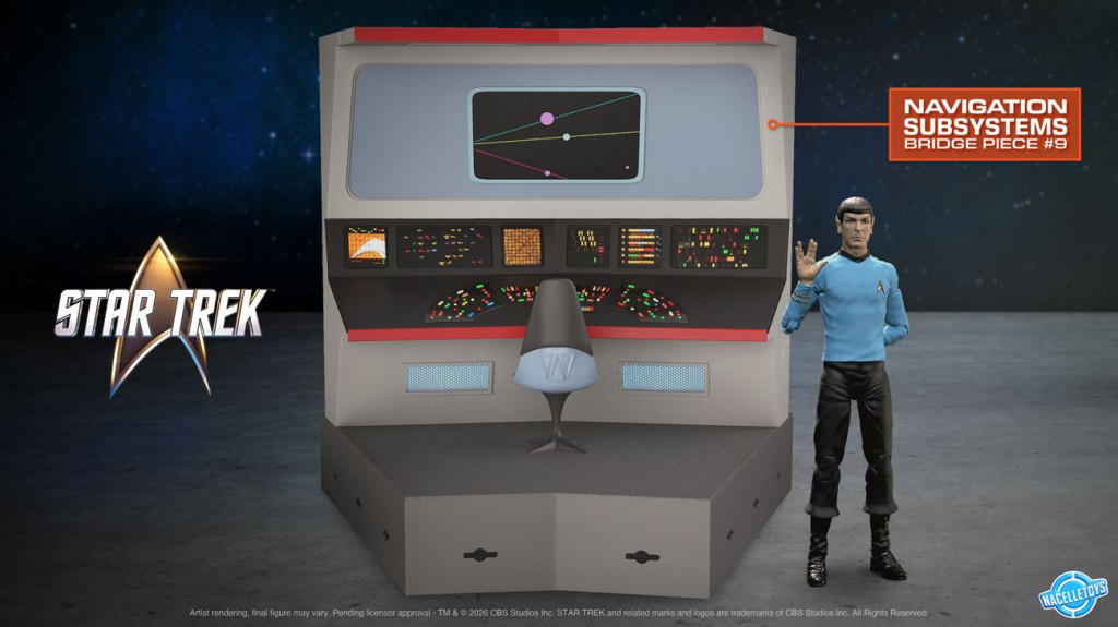
Space: the final impediment

Nacelle Toys just announced it’s making a 12-piece, 1/10-scale original-series Enterprise bridge model. The modules will be sold one per month, launching later this year to coincide with the 60th anniversary of our show.
Pricing has not been announced but it’s a fair guess the set will not be cheap. But that’s not really the problem; I love that bridge and I will find the money. No, the hurdle is space. The fully assembled piece will be 40 inches in diameter. That’s one full metre of TOS excellence.
Where will I put the thing?

I learned about this wonderful new collectible in a TrekCore article, which is where I also grabbed the bridge images; oddly, there does not seem to be anything on the Nacelle site about this. Thanks as always, TrekCore.
I am fortunate to have a sizable room for my Star Trek collection (even after recently moving to a smaller space) but the only way to accommodate the bridge is to remove something large, like a couple of bookcases or the cabinet holding my Polar Lights Enterprise or the cabinet that displays my Mego collection — and those are not options.
The only other candidate is my smallish corner desk, but that’s where I work. If I can’t work, I can’t afford the bridge.
I’ve heard from many collectors who are also space challenged. One woman I know has her stuff in boxes, and she has some excellent stuff that I don’t own. (Hey, Lisa.) So I am not alone.
And there is one more challenge: getting the pieces. I sent inquiries to a couple of local hobby/model stores and it seems Nacelle sells direct only, not through dealers. And here in Canada, getting 12 packages delivered from the US could kick-off border problems and fees.
Nacelle has handed me a real puzzle, but I love that bridge set so I need to figure out something. As Spock is reported to have said, there are always possibilities.
-
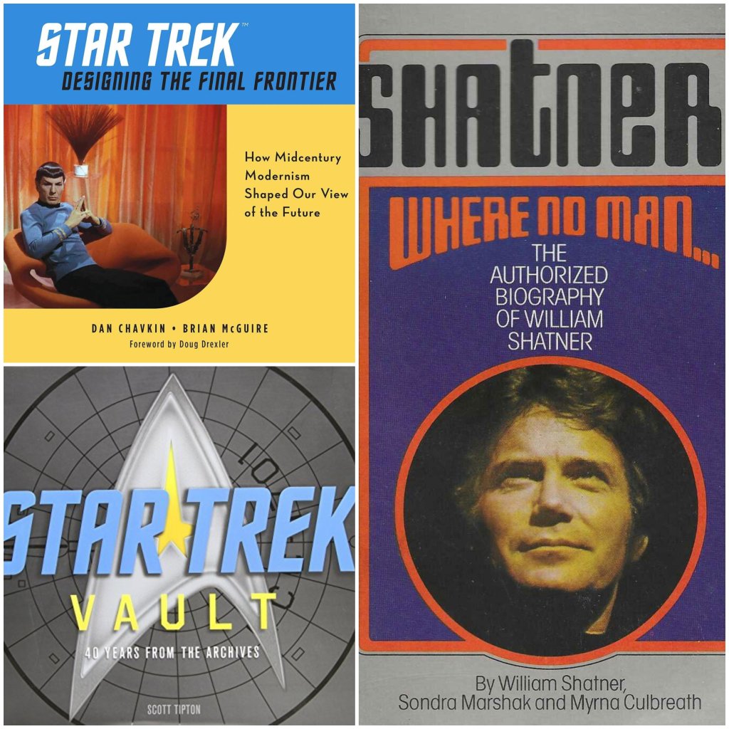
Dayton Ward and I created a Trek non-fiction reading list
I like that headline but it’s not actually true. Prolific author and well-known Star Trek fan Dayton Ward posted a list of non-fiction Trek books he wants to read or revisit, and I added my picks in an exchange on Bluesky. So, I did not collaborate with him and we’ve never even met (although I think we would get along famously), but his article plus my suggestions add up to a good to-read resource.
First, check out Dayton’s post. It’s always a pleasure to read content from knowledgeable Star Trek fans, and his suggestions are solid. And he was wise to set the following parameters, because otherwise a reading list can just become every book that says Star Trek on the cover:
While some titles will include info on the 1970s animated series and/or the follow-on movies featuring the original series cast, my primary focus will be the original show. Certain books offering an overview of the entire franchise – or at least “the entire franchise” as it was when a particular book was written – may be added to the list at some point as stretch goals if I hit the main targets, but even then I’ll likely stick to the parameters I’ve set up. This also isn’t meant to be an inclusive list…
To his selections I added the following. Some are titles Dayton considered but left off, for the reasons stated above. At least one — the DeForest Kelley biography — was new to him. (You can read his replies to my suggestions at the Bluesky link above.)
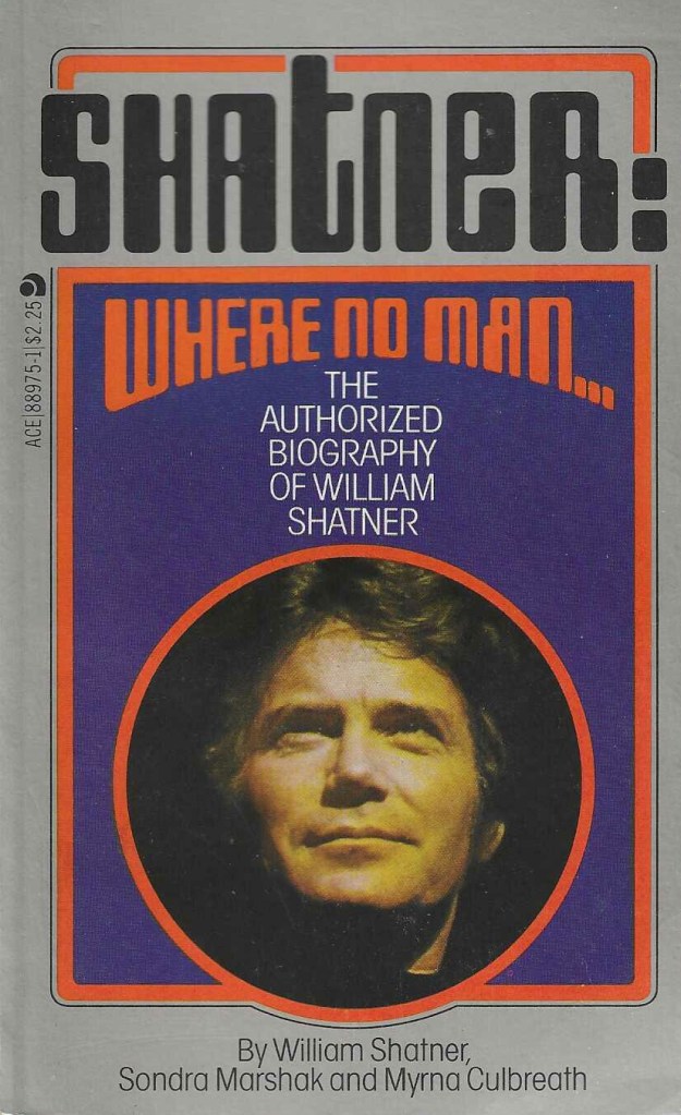
Where No Man…William Shatner, Sondra Marshak, Myrna Culbreath
I cannot say I love Marshak’s and Culbreath’s writing style, but this is the first book about Shatner and I am a completist, so this has to be on my list. Also, it comes from a time when Shatner’s public persona was a little less polished. See also this post for more on that era.
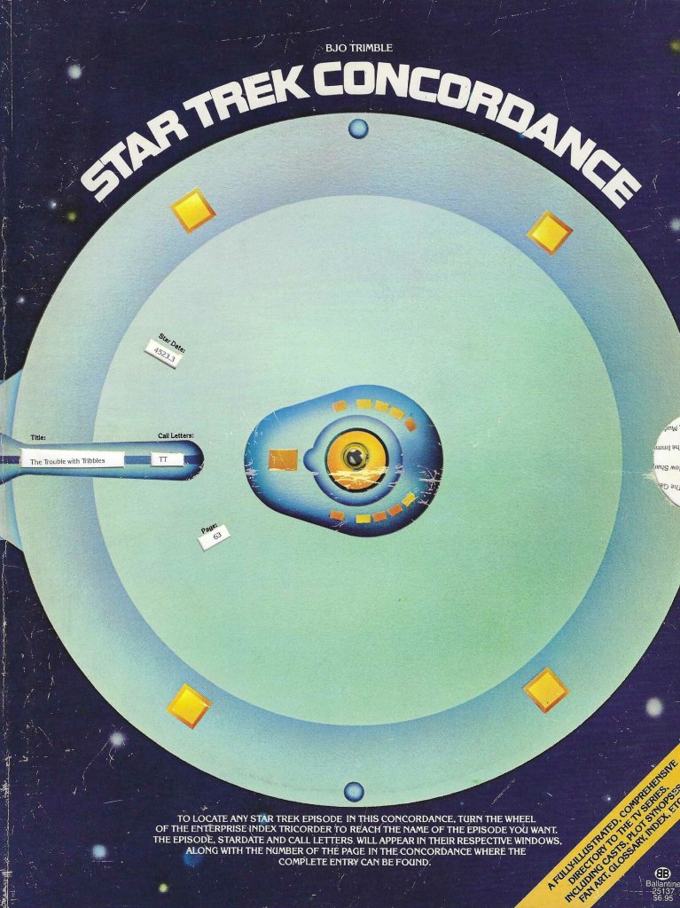
Star Trek Concordance. Bjo Trimble
This episode guide and lexicon was groundbreaking and invaluable when Ballantine published it in 1976, plus it had a spinny “Enterprise Index Tricorder” built into the cover. I also love the two fan versions put out in 1969 and 1973.
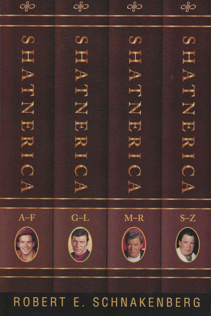
The Encyclopedia Shatnerica. Robert E. Schnakenberg
Does anyone else own this book? I have seen exactly one other copy out in the world — but in writing this post I discovered the author produced a revised version in 2008. So I have now ordered it. Thanks, Dayton.
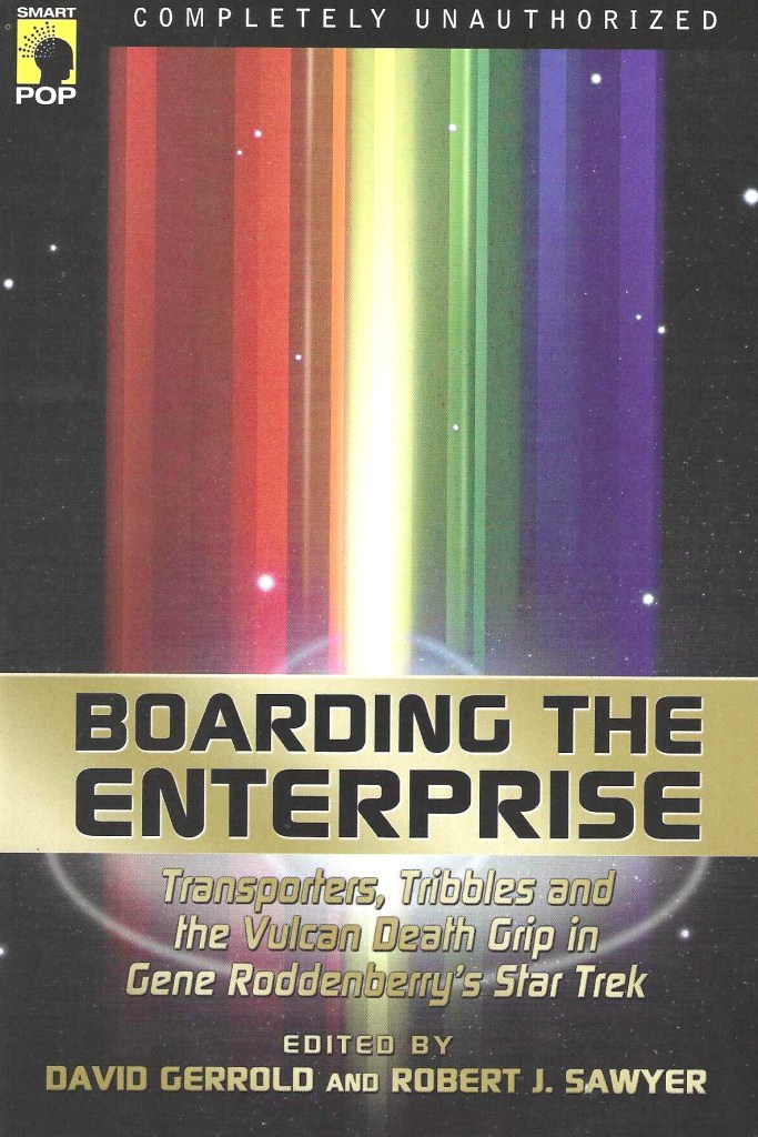
Boarding the Enterprise. David Gerrold, Robert J. Sawyer
This is an intelligent and challenging collection of essays examining philosophical, scientific, and cultural questions, edited by two prominent thinkers in our fandom. It is not a light beach read, but it is the best analysis I’ve read of this cultural phenomenon. My article on the book is here.

A Harvest of Memories. Kristine M. Smith
Deforest Kelley is the least known of Star Trek’s major players, because he was a more private person than some and because he never wrote his own book, so perhaps the best way to get a little closer to the actor is through a woman who called him a friend for years.
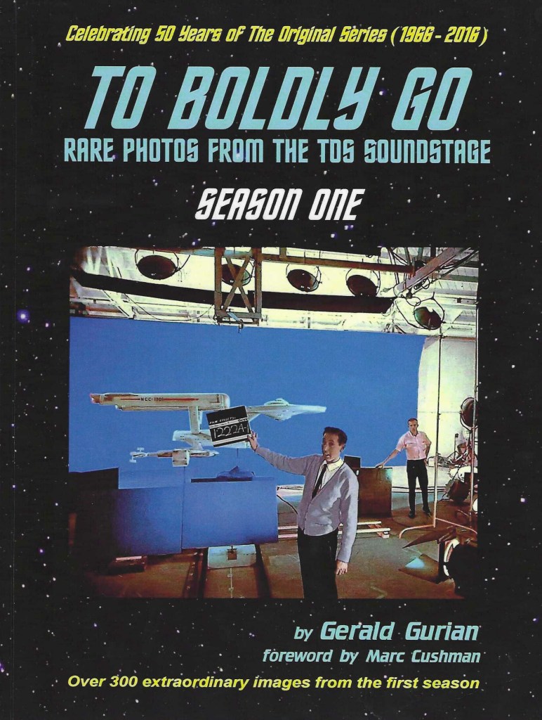
To Boldly Go: Season One, Two, and Three. Gerald Gurian
Dayton chose Star Trek: Lost Scenes for his rare-pics fix, and it is an excellent book, but I encouraged him to add this three-volume work to his list. Gerald has a remarkable collection and we are lucky he shared it.
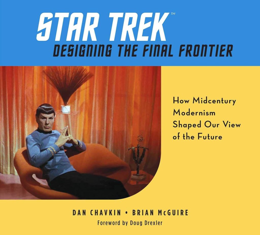
Designing the Final Frontier. Dan Chavkin, Brian McGuire
Star Trek is as defined by its look as by its acting and writing, and this examination through the lens of midcentury modernism is fascinating. Plus, the research is impeccable and the images are excellent.
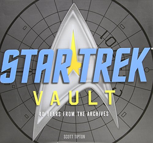
Star Trek Vault. Scott Tipton
This did not make Dayton’s cut because it is “more of a franchise book than a TOS book” and that is valid, but don’t let that stop you. This is another thoroughly researched work, and it is unique because it includes 14 reproductions of cool collectibles. If you ever feel the need to own some vintage merch, the Vault delivers.
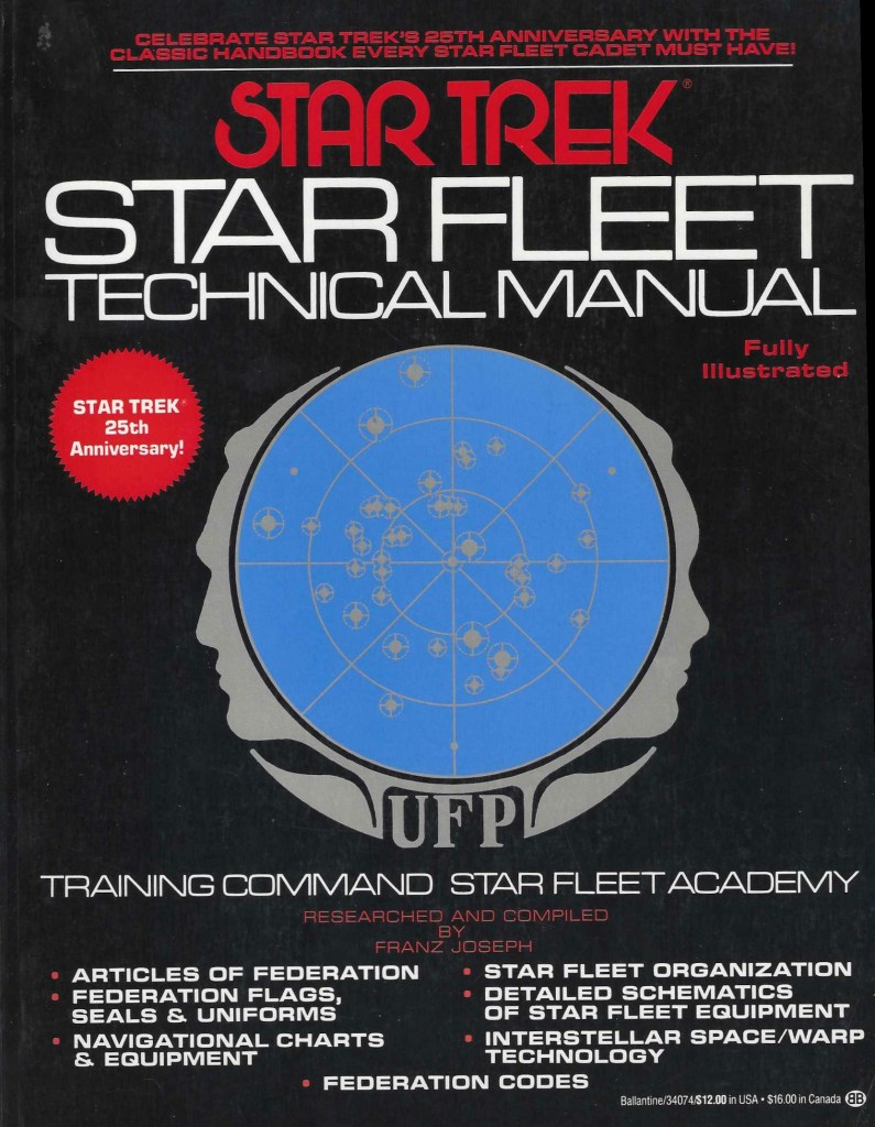
Star Trek Star Fleet Technical Manual. Franz Joseph
On this point I must simply disagree with Dayton. Again, his reasoning is sound, given his rules: the manual is “‘inside the box’ and I was making a conscious choice to exclude those.” But, for me, any guideline that eliminates this foundational resource must bend to add it.
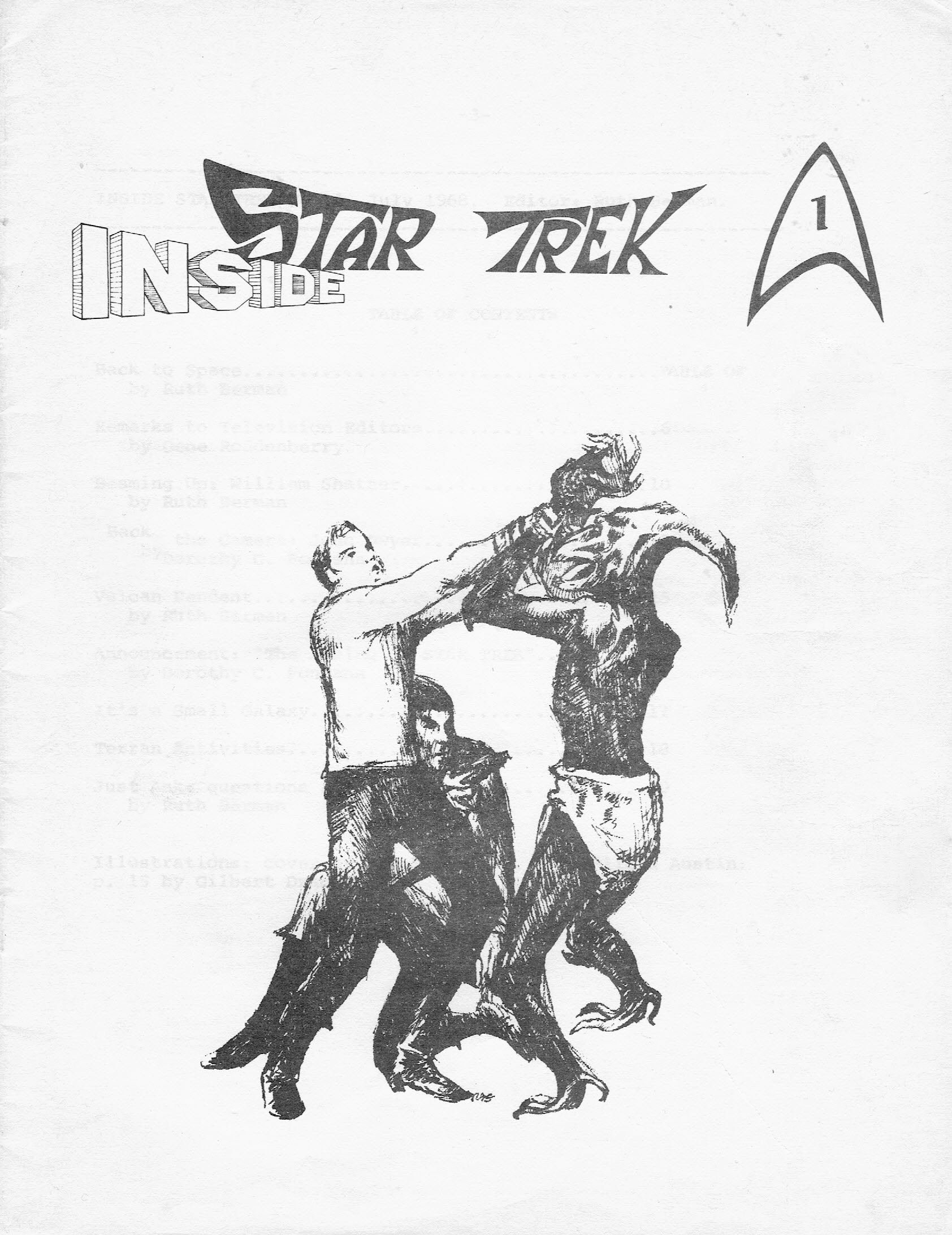
Those are my nine book suggestions, but I also pushed for the inclusion of the Inside Star Trek newsletters (and here is my ongoing review of those), the Star Trek Giant Poster Books (my series on those) and the Spockanalia fanzine (which I own but have not yet covered).
Thank you, Dayton, for the list and the inspiration to add to it. I am often skeptical of Star Trek lists, as they are written either by people with little knowledge or designed simply to generate clicks (or both), but I really liked what you did here and I recognize the expertise and the years of fandom underpinning it.A Harvest of Memories, Bjo Trimble, Boarding the Enterprise, Brian McGuire, Dan Chavkin, David Gerrold, Dayton Ward, DeForest Kelley, Designing the Final Frontier, Franz Joseph, Gerald Gurian, Inside Star Trek newsletter, Kristine M. Smith, Myrna Culbreath, Robert E. Schnakenberg, Robert J. Sawyer, Scott Tipton, Sondra Marshak, Star Fleet Technical Manual, Star Trek, Star Trek Giant Poster Book, Star Trek Vault, The Encyclopedia Shatnerica, To Boldly Go, Where No Man, William Shatner -
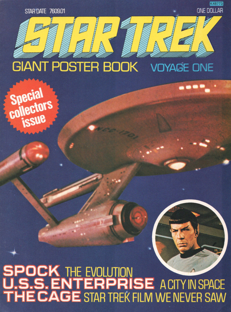
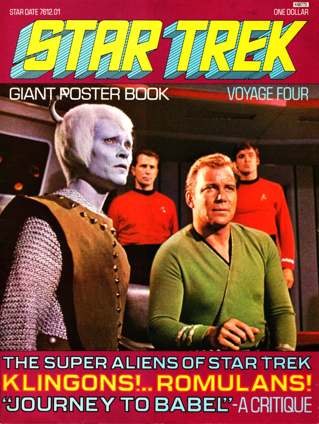
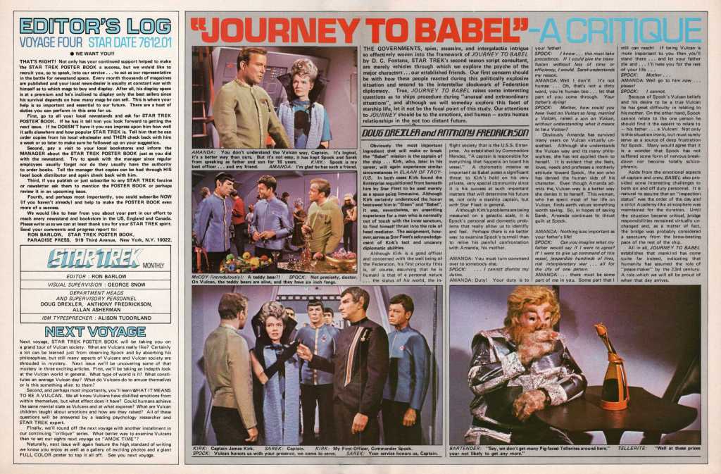
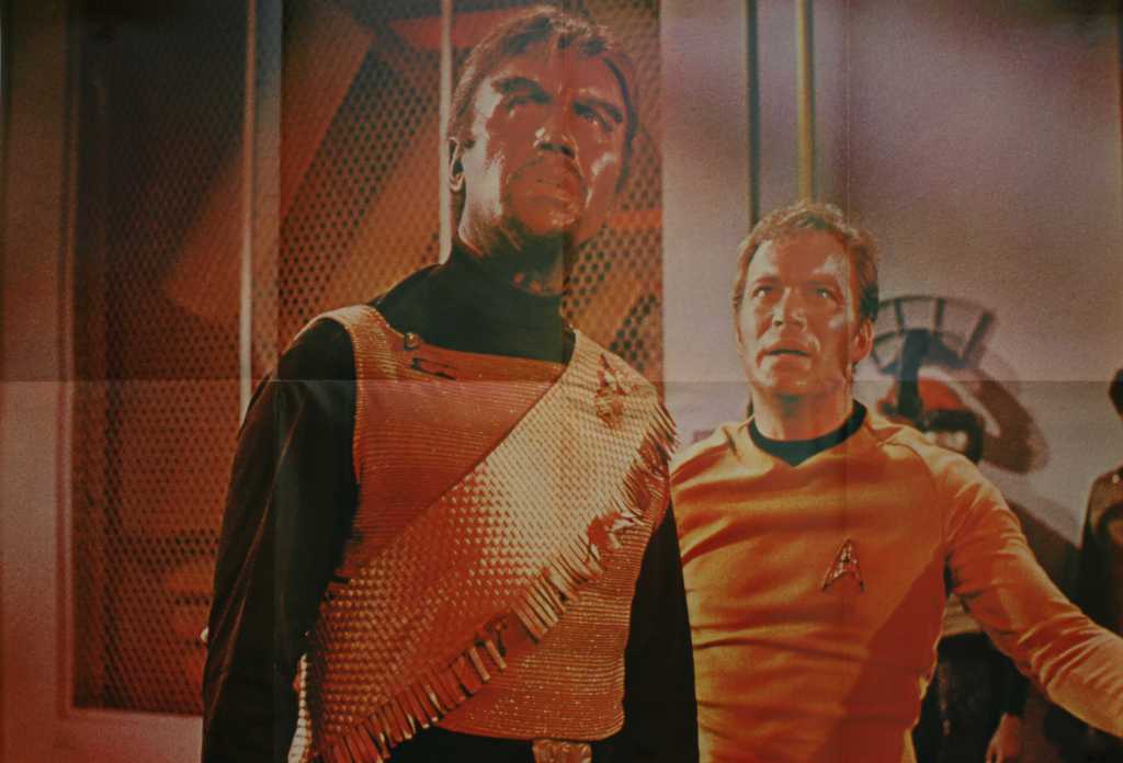
Giant Poster Book four: super aliens, a sort-of review of Babel, plus tribble trivia
The Star Trek Giant Poster Books were the first professionally published Trek magazines. Seventeen issues were produced between September 1976 and April 1978, plus a 1979 “Collectors Issue” devoted to The Motion Picture. Each delivered six pages of content plus the cover and back cover and folded out into a large poster.
I own the complete set and will cover each issue. The story of the magazine’s genesis is told here.
Here are highlights from issue four, published in December 1976, plus a scan of the magazine.
The first three issues of the Star Trek Giant Poster Book are excellent. The fourth is a bit of a miss. It happens. Even the excellent first season of TOS gave us The Alternative Factor.
Issue four opens with a clever editorial from Ron Barlow. Fans had worked to delay the cancellation of the series, so he tried to get some of that same energy behind the pages of the magazine. He urged readers to pester newsstands and book stores to stock it, encourage fanzines to write about it, and — of course — asked them to dig out $10 for a subscription. Eighteen issues were published, so the appeal was a success of sorts.
What follows in this issue, though, may not have pushed many sawbucks into envelopes. We get a review of Journey to Babel that somehow ignores the emotion, excitement, and tension of the story, telling readers:
A diplomatic mission as important as Babel poses a significant threat to Kirk’s hold on his very private, very special community since it is his success at such important matters that will determine his future, not only as a starship captain, but with Star Fleet in general.
What? We also get: “Although Kirk is a good officer and concerned with the well being of the Federation, his first priority (this is, of course, assuming that he is human), is that of a personal nature…” Assuming he is human?
Allan Asherman’s rundown of The Super Aliens of Star Trek is really just a list of powerful beings and a reminder of in which episode each appeared. But this is actually more useful than it might appear today. In 1976, Bjo Trimble’s Star Trek Concordance was only just becoming widely available and Asherman’s own The Star Trek Compendium was still five years away. So lists were reference resources, and probably welcomed.
The final two articles are basically fan fiction about the history of the Klingons and Romulans. Again, some perspective helps here: the total number of Star Trek tales then was tiny compared to the ranks of episodes, novels, short stories, and comics we have today, so fans may have enjoyed these pieces.
The best bits of this issue are the last two pages. The ad for the magazine itself is humorous, pushing the publication as a treatment for Star Trek Fever. And the answers to the trivia questions from issue three are interesting, especially the statement that 1,000 tribbles were sewn for The Trouble with Tribbles, in four variations. I have no idea if that is correct.
And the poster is excellent.
Let’s hope the next outing is better. I am about to read issue five for the first time in many years.
-
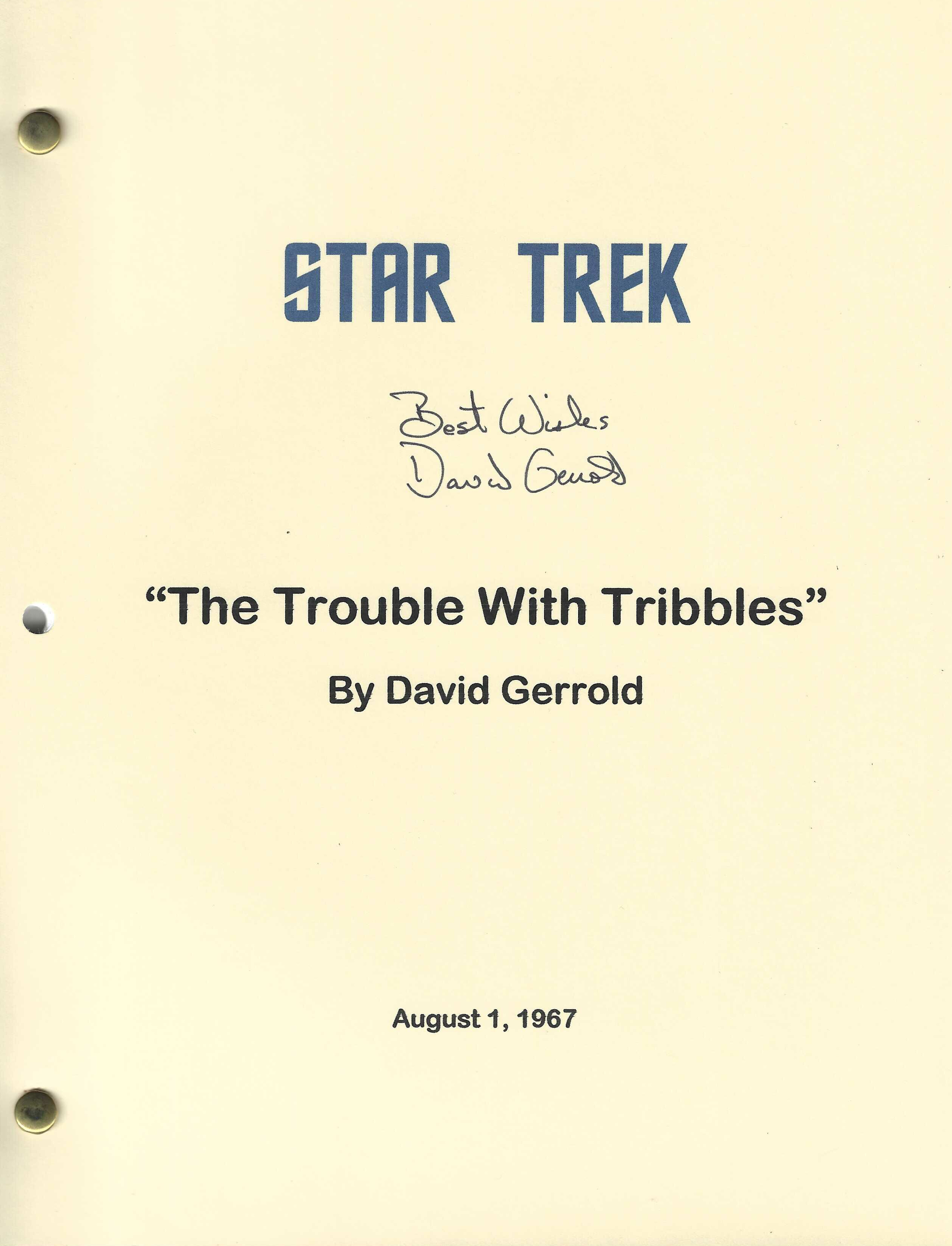
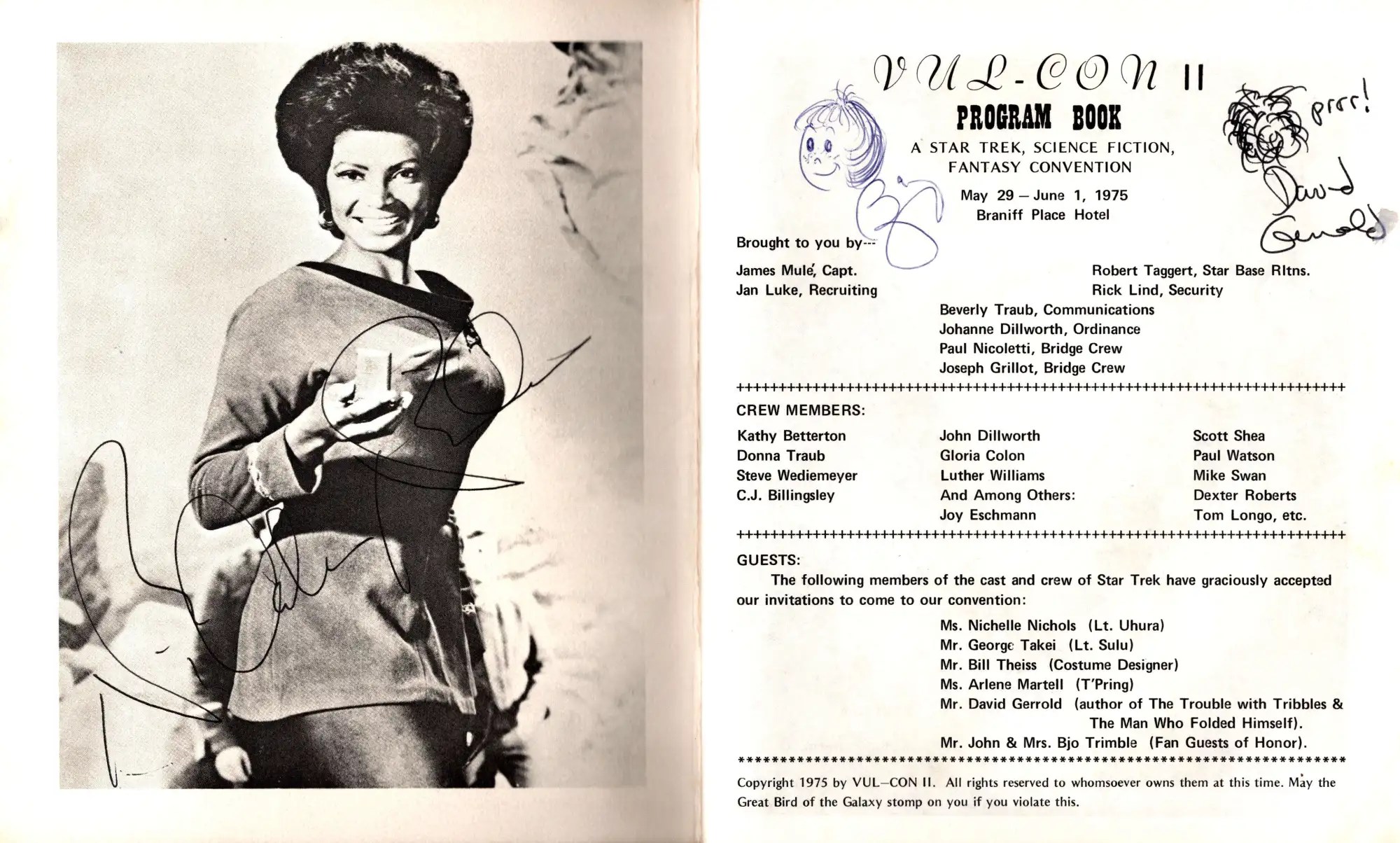
David Gerrold is a good guy — and he needs help
David Gerrold is ill. The author of The Trouble with Tribbles, uncredited polisher of many scripts, writer of the animated episodes More Tribbles, More Troubles and BEM, story editor early in the production of The Next Generation, and prolific fiction writer outside of Star Trek reluctantly launched a GoFundMe to help with medical bills.
I am sad to say I have never met David, but from all I have heard he is a great guy. For example, he is a regular tour guide and presenter at the Star Trek Original Series Set Tours in Ticonderoga, and my friend Robert J. Sawyer (his site, my site) likes him a lot. I asked Rob to tell me just a little about David.
David Gerrold and I have been friends for thirty years — a fact that astonishes me. Not, I hasten to add, because it’s hard to be David’s friend. It isn’t; he’s a warm, wise, caring man. But because, way back in 1972, the very first adult science-fiction novel I ever read was David’s own first novel, Space Skimmer. The notion that someday I’d meet this man, let alone visit him in his home, or travel with him to Turkey, or co-edit with him the essay collection Boarding the Enterprise, or write the introduction to the latest edition of his masterpiece The Man Who Folded Himself, would have been inconceivable to twelve-year-old me.
But it’s a friendship I cherish. David has made the world a better place through his heartfelt and moving writing, through his nurturing of other writers, through his fundraising for AIDS Project Los Angeles, through his advocacy, and through his devotion to his wonderful son Sean. If anyone deserves to live long and prosper, it’s David.
So he’s a good guy and a Star Trek luminary. Send him some money, if you are able.
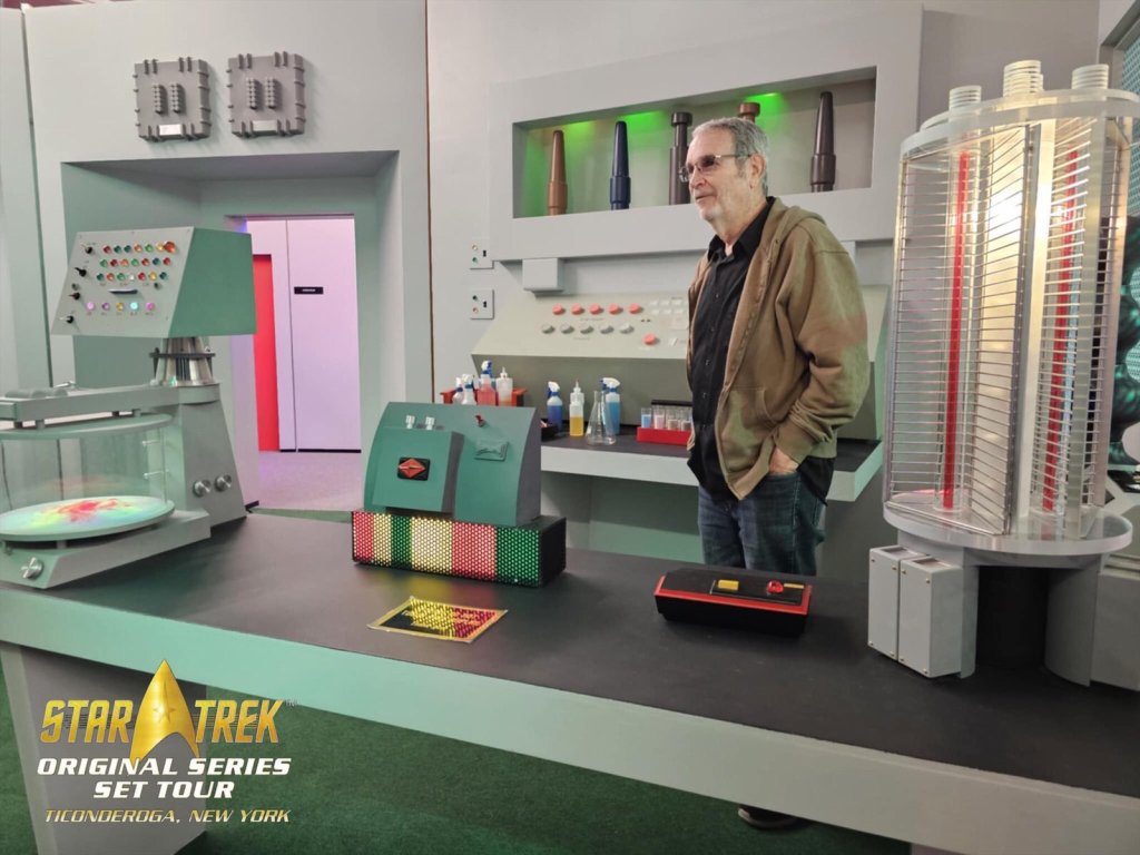
Photo credit: Star Trek Original Series Set Tour I have not met David, as I said, but I have a few collecting stories to share.
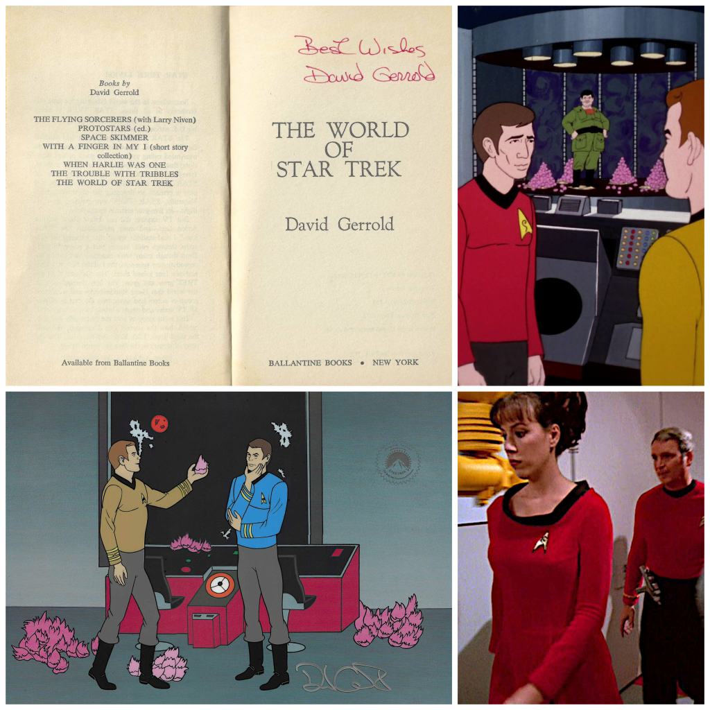
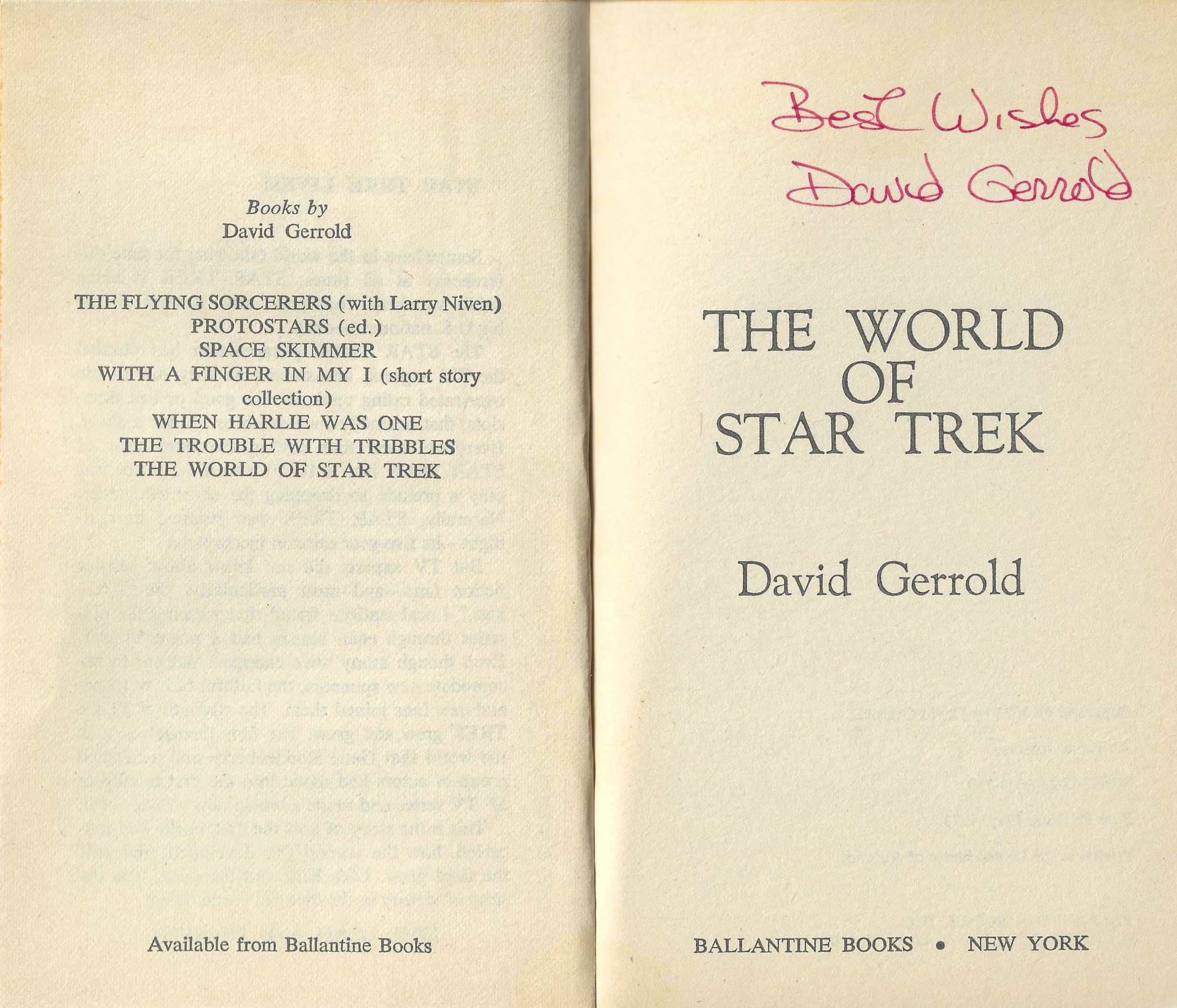
A bookstore find
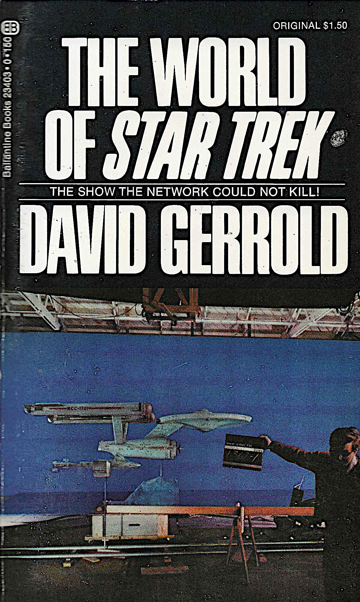
I own about 150 TOS autographs, and my first was David’s. He had signed a first edition of his book The World of Star Trek and it ended up on the shelf in Toronto’s Bakka book store. It was published in 1973; I bought it about six years later. It was amazing to me that a person so important to Star Trek had held the same book I now owned, and it started my collecting journey.
An eBay find
My second David autograph is on a seri-cel. (What’s a seri-cel?) I spotted it on eBay in 2013. It’s a great scene from his More Tribbles, More Troubles episode, but I did not know if the signature was real. So I emailed him through his site, and he got back to me quickly: “Yes, I did sign those. Thanks for checking.”
That brings up a good collecting tip: if a person related to a collectible is still with us, reach out with any questions about authenticity. They are often happy to be asked. That has also worked for me with Noel Sturgeon, Susan Sackett, Howard Weinstein, and others.
A surprise find
I also have David’s autograph on The Concordance Color Book but I did not know it was there. The signatures of DC Fontana and Gene Roddenberry were also big surprises.
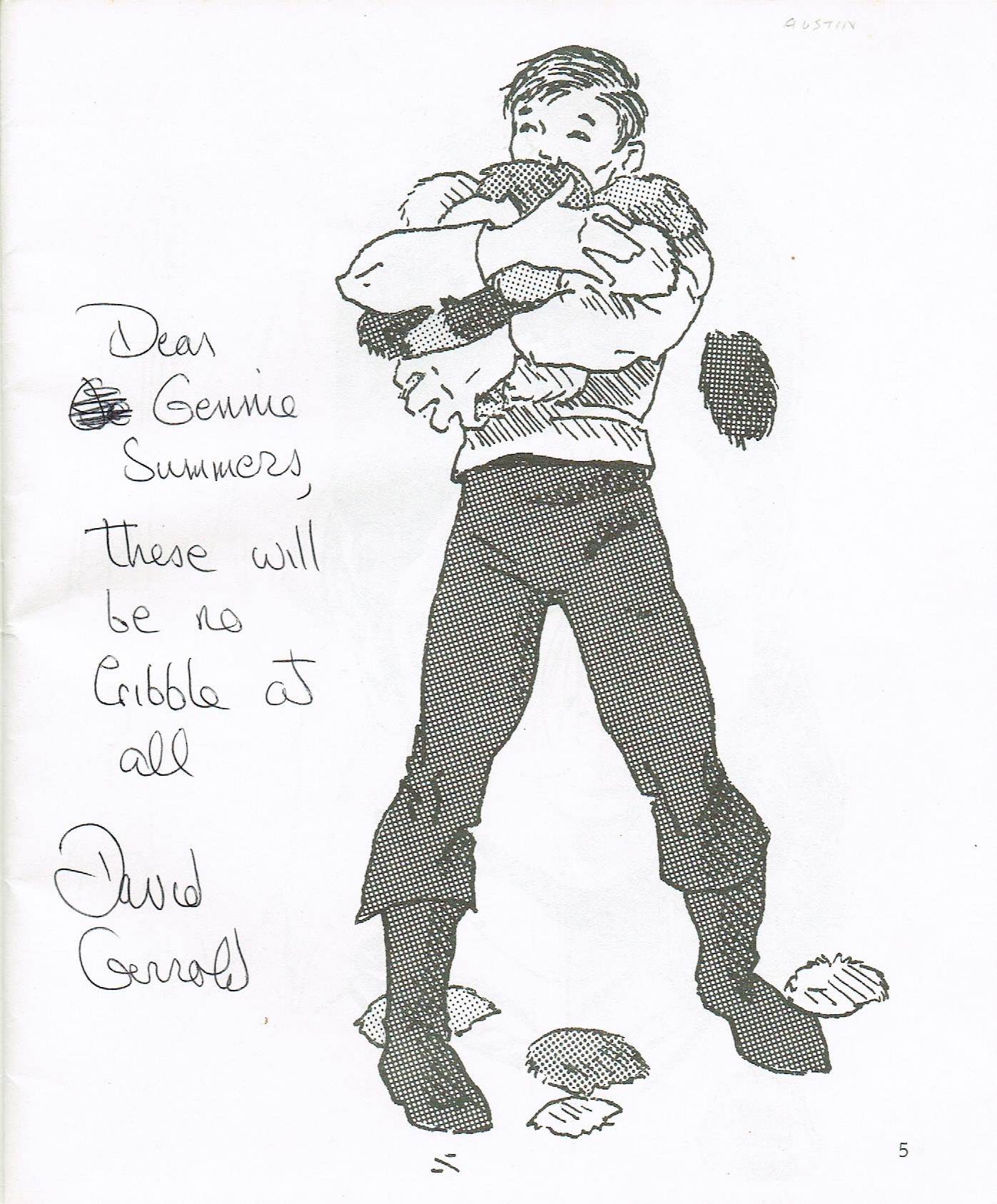
And I have three more: a Tribbles script, purchased from his site; a convention program; and an Escape From The Planet Of The Tribbles script, bought at the Star Trek Tours last year.

I shared some collecting stories, because that’s what this site is about, but my goal here is to encourage people to send David some help, if they are able. We don’t often have the chance to give tangible thanks to the people who helped build this world for us.
I will give David the last words here. This is from his GoFundMe, where he has posted some fiction to thank people for visiting the page, whether they donate or not:
…there are people in much more serious circumstances. If you can afford to donate, donate to them first. If you want to help me finish the book, and if you can afford it, then I thank you in advance. And if you can’t, then just download the files as a thank you for reading this far.
-
Harlan Ellison really hated The Motion Picture
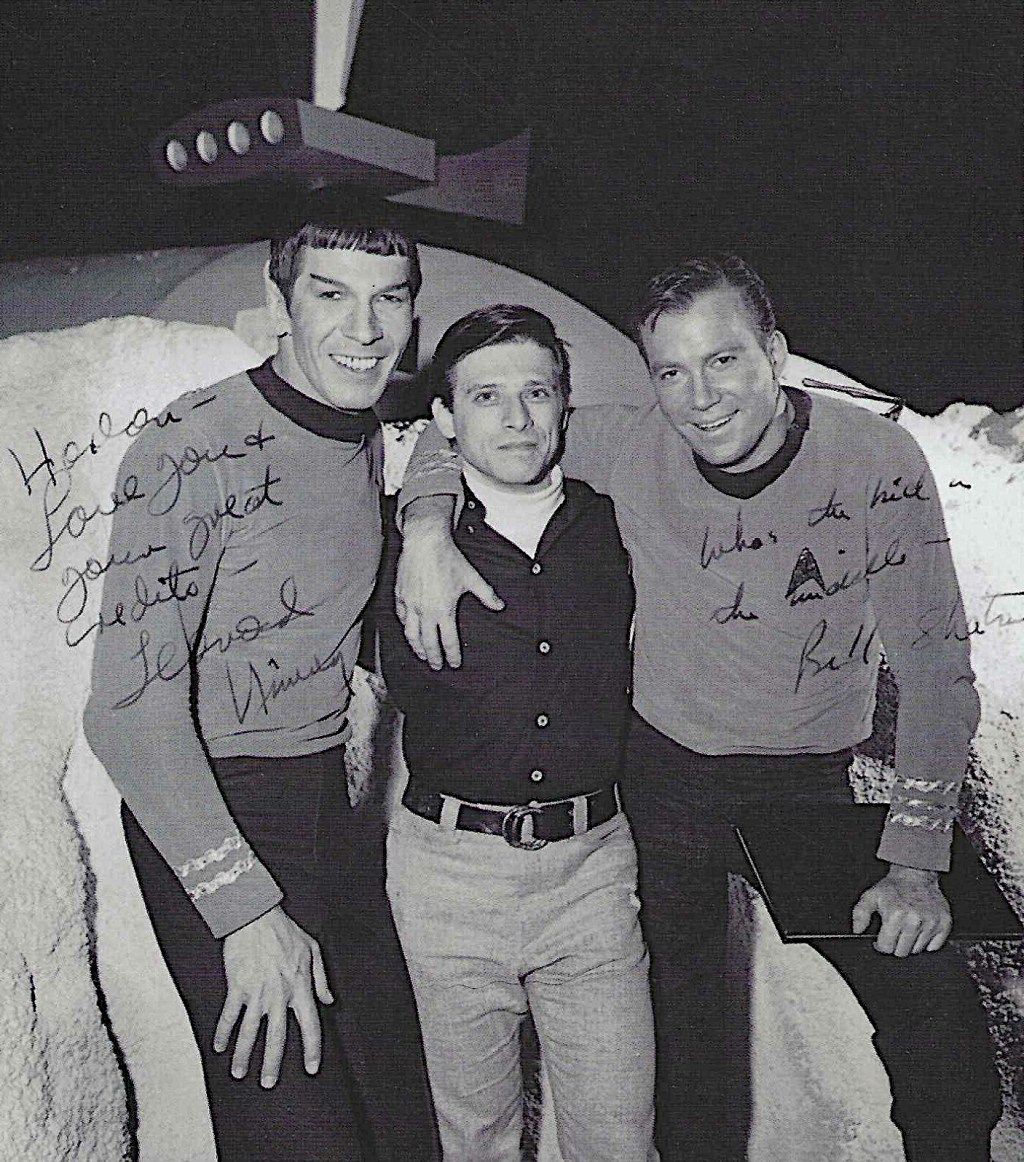
Lots of critics dumped on The Motion Picture back in the day. Gene Siskel, for example, speaking in 1982 and therefore enjoying the opportunity of three years to mellow his opinion, still called the movie a “worthless bore.”
Harlan Ellison was equally scathing, but his take in Starlog issue 33 from April 1980 was even more brutal as he was a Star Trek luminary. This call was coming from inside the house.
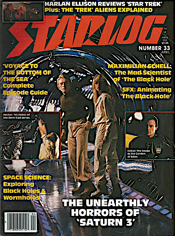

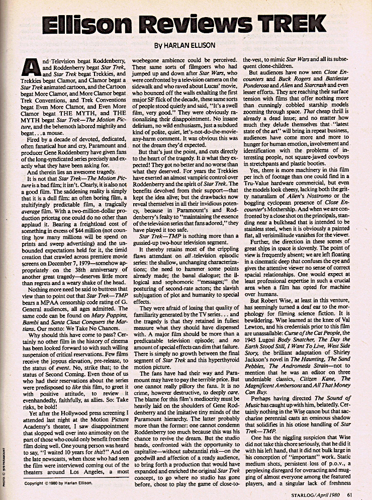

The Motion Picture, Ellison wrote, is a “dull film: an often boring film, a stultifyingly predictable film, a tragically average film.” The movie suffered from “shallow, unchanging characterization; the need to hammer some points already made; the banal dialogue; the illogical and sophomoric “messages;” the posturing of second-rate actors; the slavish subjugation of plot and humanity to special effects.”
Similar opinions were fairly widespread then and are still held by many today. What’s interesting, though, is who Ellison blamed: the fault was partly in the stars (those second-rate actors) but it was mostly the fans who pulled down the enterprise, by forcing Gene Roddenberry to serve a bland pablum rather than an exciting new dish.
[Fans] got no better and no worse than what they deserved. For years the Trekkies have exerted an almost vampiric control over Roddenberry and the spirit of Star Trek. The benefits devolved from their support—that kept the idea alive; but the drawbacks now reveal themselves in all their invidious potency, because in Paramount’s and Roddenberry’s fealty to “maintaining the essence of the television series the fans adored,” they have played it too safe.
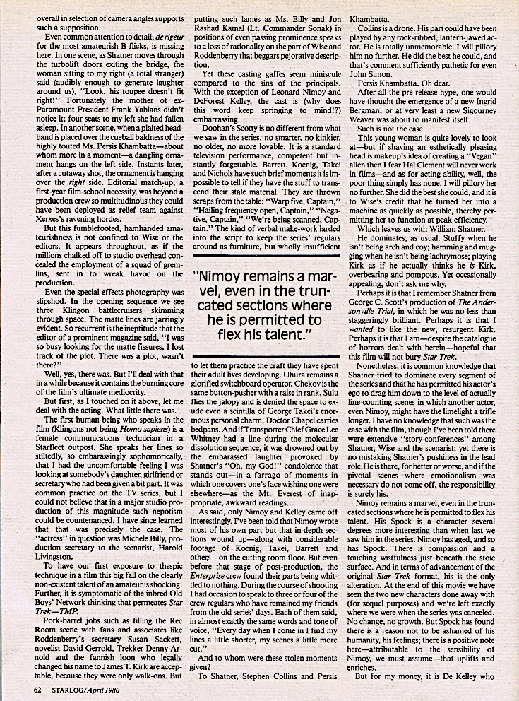
His reference to the spirit of Star Trek is ironic, as in my opinion he never understood exactly that. His review continued the long Ellison tradition of ignoring the essence of the show in favour of a story he thought should be told. You can see this clearly in his version of The City on the Edge of Forever. I have detailed my problems with Ellison’s script, so I will only say here that the tale and his decades-long devotion to it prove he misunderstood what made Star Trek Star Trek.
Also, in dismissing the fans of the 1960s and 1970s, he looked away from the most amazing accomplishment in all of fandom: the resurrection and huge success of a franchise about to celebrate its 60th anniversary. To steal a line from Firefly, “We’ve done the impossible, and that makes us mighty.”

It’s not that Ellison was entirely wrong: the movie is on the slow side, and when he said a “major film should be more than a predictable television episode” he drew a comparison to The Changeling. But he often seems to stretch to find negativity. For example, he said the “models look cheesy.” That is ridiculous; the Enterprise and the three Klingon ships are gorgeous. He also wrote that “There is simply no growth between the final segment of Star Trek and this hyperthyroid motion picture.” No growth in a starship commander unhappy with promotion beyond command, in a half-Vulcan working to purge his human side, in a best friend who has left Starfleet for a simpler medical career, and in a crew that has matured to new responsibilities and new adventures.
Clyde Gilmour, writing in The Toronto Star, gave the outing a mixed and fairer review: “The movie is not as much fun as Star Wars, not as majestic as Close Encounters, not as scary as Alien. But it’s just as handsome and just as lavishly produced as any of them and is compulsively watchable all the way, though it drags at times. On the whole, however, it is curiously unexciting.”

Ellison wrote in his piece: “There is no meanness in me.” I would like to think that is true, but he does not make it easy. Some of this seems mean, and feels like the intent was to be so. But I have also written about the differing opinions on the man and suggested that Ellison’s challenging persona was part of a public schtick built partly on throwing punches. The headline on his review of Star Wars was Luke Skywalker is a Nerd and Darth Vader Sucks Runny Eggs.
Ellison courted controversy and I wish to this day that I had known the man but, absent personal experience, all I have is what he put out into the world. And this review does not make me like him more.
Postscript
The film has risen in the estimation of many, due in large part to the 2022 release of the excellent The Director’s Edition. That version of the film is far closer to what director Robert Wise would have done with a few more months to shoot and edit. If you have not seen The Director’s Edition, you have not really seen The Motion Picture.
-
Read NBC’s promo booklet for its new show
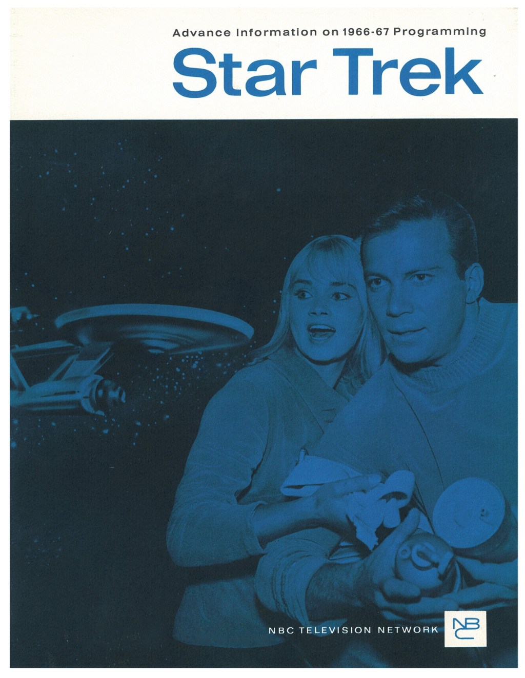
NBC used a few vehicles to promote Star Trek. It produced some commercials, included the show in its NBC Week kickoff for the 1996 TV season, and distributed an “Advance Information” booklet to boost awareness among advertisers and broadcast affiliates. That featured the second pilot, Where No Man Has Gone Before, and is an interesting look at the business of mid-sixties television.
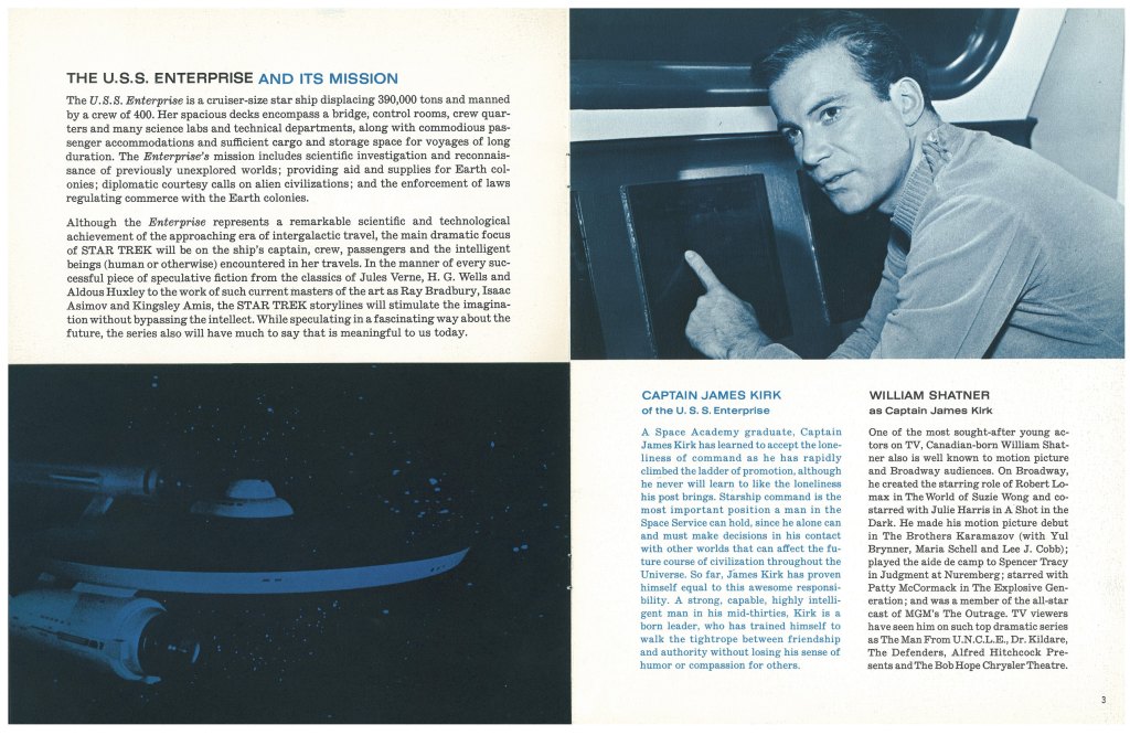
A few photos stand out. The first is the cover shot, partly because it features Andrea Dromm’s character Yeoman Smith, who we would never see again and who didn’t have much to do in the episode. The thinking behind the cover photo probably began and ended with “Dromm is an attractive woman.” The write-up she received suggests her role was intended to be recurring. She was instead replaced by Grace Lee Whitney’s Janice Rand in The Corbomite Maneuver, the next episode produced.
The photo is also notable because Smith seems to be holding a dish cloth while our Captain clutches some…maybe kitchen canisters. I am not sure.
A lot of the publicity photos, especially the early ones, followed the creative approach of “grab whatever is handy,” like the flashlight photos of Spock, Rand and Kirk.


The second standouts are the infamous Spock airbrush pictures. NBC execs were apparently worried about the Vulcan’s “satanic” appearance, so they rounded the pointed ears and curved eyebrows. That was obviously the wrong move; Spock quickly became the most popular character and his distinctive look was a big contributor. But it’s an odd decision specifically because Where No Man… had already been filmed, so viewers would see Spock in all his alien glory whatever NBC did on these pages.


But my favourite bit of this booklet is that Sulu, as the ship’s astrophysicist, gets to decide if the captain is allowed to head planetside: “Frequently, it is [Sulu’s] assessment of the conditions on unexplored planets that finally determines when and how they will be explored, or if they can be explored at all.”
Imagine this scene: Kirk rises from the captain’s chair and snaps out commands ordering a landing party to the transporter room—but then the turbolift whooshes open and Sulu strides in saying “Belay that order, Captain! My astrophysical assessment says no to visiting this planet.”
George Takei would have enjoyed playing that.
It is also funny to see that one of Captain Kirk’s main responsibilities as the commander of this awesome vessel of exploration is the “enforcement of laws regulating commerce with Earth colonies.” This brings to mind Gene Roddenberry’s first draft of the opening narration, in which Kirk would have said “the giant starship visits Earth colonies, regulates commerce, and explores strange new worlds and civilizations.”
A five-year mission to ensure that credits keep flowing to shareholders would have been far less interesting to viewers although, to be fair, commerce is essentially the driving force behind The Devil in the Dark. Kirk needs to stop the killings but those humans are only in danger at all because “Janus Six could supply the mineral needs of a thousand planets.”
Other fun bits from the NBC promo:
– The Enterprise serves instant coffee.
– Sexism was popular back then: Dromm’s Yeoman Smith is a “welcome change of scenery.” See also Herb Solow calling Nichelle Nichols a “shapely broad” in the January 1967 issue of Ebony.
– NBC’s promotion department repeated the untrue story that Gene Roddenberry was the “head writer” for Have Gun—Will Travel. There was no such position on that show, and I believe it was Roddenberry who liked to spread that exaggeration.
– Nimoy did not appear in the movie Seconds. It seems he shot a scene but it was cut from the movie.
It is interesting to wonder what would have happened had the network put more support behind this interstellar vehicle. This promotional piece was a good start.

Collecting Trek
A TOS collection 40 years in the making
