Matt Jefferies is a hero. He created the world Star Trek inhabits, starting with the Enterprise. Gene Roddenberry made it clear he did not want a rocket ship, and Matt executed on that vision. And, while he is rightly lauded for creating the best ship in all of science fiction, his greatest contribution was actually the sets he designed for the story of the week.
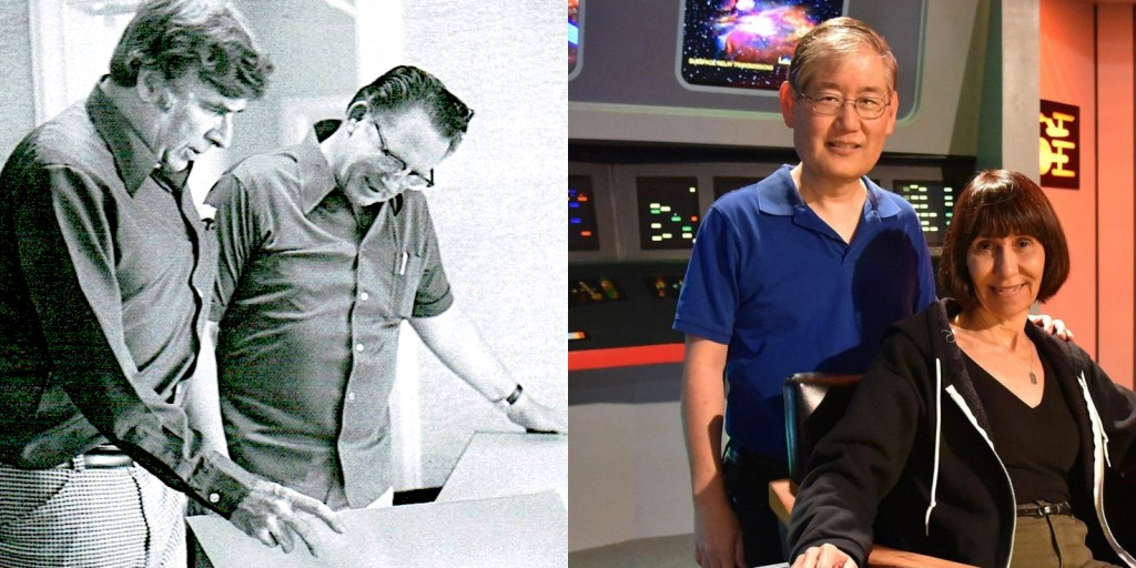
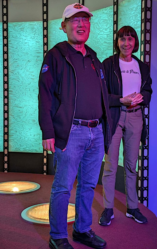
I was invited to speak again at the Star Trek Original Series Set Tour in Ticonderoga, NY, this September. Michael and Denise Okuda were there, with other celebrity guests including George Takei, Jonathan Frakes, Brent Spiner, David Gerrold, Robin Curtis, and Bjo Trimble. Mike and Denise are Star Trek design royalty themselves, and therefore uniquely qualified to talk about Matt Jefferies.
Here is an edited transcript of our conversation.
Do we all agree that Matt created the most beautiful ship in all of science fiction?
Denise: Yes, in our opinion.
Michael: There is no doubt. And it is not just that it is a beautiful design. Matt Jefferies had an impossible task. He needed to show a spaceship that was so far advanced over anything that was current…yet he had no idea how it was powered or how it would operate. He had to come up with something that was distinctive from everything that had come before and yet it had to have an air of believability. Because of his artistic design sense and his use of aircraft logic, that ship is absolutely distinctive.
Put another way, one of the things that artists fear the most is the blank page, and no artist in film or television has ever faced a page as blank as Matt Jefferies did when Gene Roddenberry said: I don’t care how you design it, just make it look like it has power and I don’t want to see rocket engines or fins or anything like that.
Matt came up with a solution that not only worked well then but works well today.
Tell me about his design philosophy.
Michael: A lot of what we think of as futuristic design, especially back in that period, was either very curvy or was very busy, with lots of stuff. And both of those are relatively expensive: curved structures and curved shapes are inherently more expensive to fabricate than straight lines, and lots of intricate controls and meters and dials and gauges are expensive, not just to buy but to wire up and rig.
That is something Matt could not afford, on the budget and the schedule. So Matt thought outside of the box: he decided that space flight is so advanced that it becomes simple. So the hallmark of what he did in the original Star Trek is he had immensely simple designs. It looked like it had great thought behind it and great functionality. It wasn’t interesting shapes for the sake of looking cool; instead, you had the sense that it was there for a reason. That helped you believe in the ship and therefore in the show.
Denise: Michael and I are attracted to simplicity of design, and that is Matt Jefferies. They could not afford to use the latest and greatest toggle switches or whatever, they had to think of something they could do within the time and budget. The result is that 60 years later, it is not dated. It is a unique look but it is not dated.
Michael: If you look at the hallmark of high technology and space flight at the time, that was Mission Control in Houston. Look at those panels: there were push buttons and toggle switches, and rotary handset telephones to communicate. Obviously this was well designed — it literally got us to the Moon. But if they had used that latest-and-greatest technology on the Enterprise, it would be long obsolete (by now). Instead, Matt took a rather strange style, these screens with blinky icons and the jelly beans (buttons), and he said “That’s the future.” He was consistent with it, he did it with aircraft logic, and it still holds up today.
So the design was attractive but also practical?
Michael: Yes. For example, when we talked to Matt about the Enterprise design, he wanted the hull to be smooth. He didn’t want stuff sticking out. His argument was that space is a dangerous environment, so design the ship so that everything could be performed from the inside. That made the exterior of the ship look simpler and cleaner, and whenever anything goes wrong, we do [repairs] from inside the ship.
That was visionary on his part, but it was also practical, as they wanted to avoid space-suit scenes.
Doug Drexler told me he had the same thought about repairs with his NX-01 design for Enterprise.
Michael: Right, because he wanted to echo what Matt had done.
Doug probably also touched on this, but one of the criticisms of the Enterprise design is that if those engines were rockets and you were to start them up, the ship would tumble. There are those who say that Matt should have thought this through better. I entirely disagree. To me, that means the Enterprise operates on principles of physics that have not yet been discovered, and that speaks to that ship being so advanced.
As proud as I am to have worked on the Enterprise D and other Enterprises, most of those have really strong pylons, so I can see they’re paying homage to the design heritage but I think they miss something.
And there is a timeless quality to the TOS look.
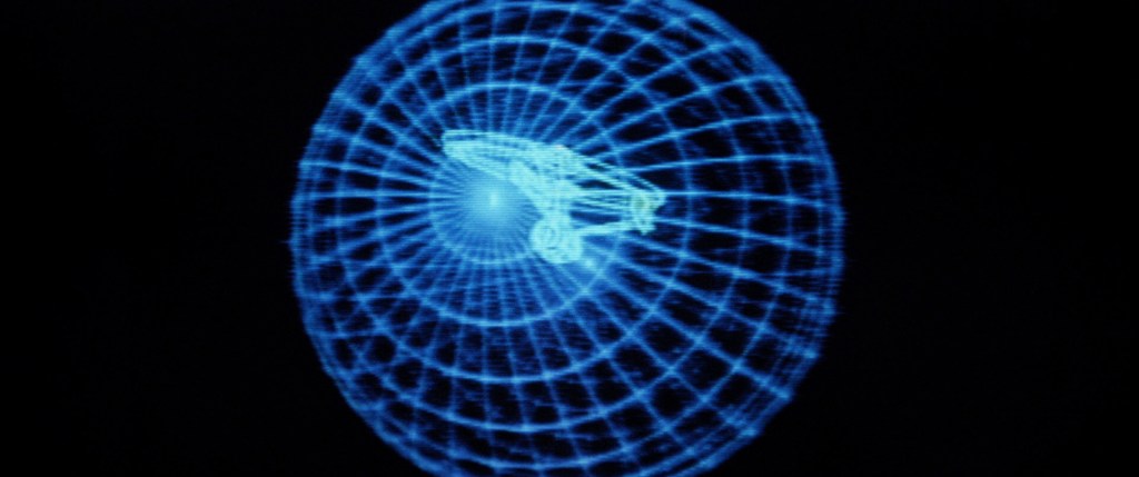
Michael: Yes. Another example is the opening of Star Trek II, The Wrath of Khan: they had that wire-frame video on the bridge with the Enterprise. At the time it was very cool, it was state of the art; they used an Evans & Sutherland vector computer, which was bleeding-edge technology at the time. But now it looks quaint. I still love the movie, and I admire them for being able to pull that off because I loved it at the time, but it doesn’t hold up as well as what Matt did with much smaller resources.
We don’t know much about Matt. Tell me about him as a person.
Michael: He was immensely talented and a little befuddled by the adulation he received. He was proud of his work, but…
Denise: He was bemused that people paid such close attention to the designs and were so curious about them. He was humble but I also think he looked at it as just a project he worked on. He was proud of it but it was a job and then he moved on to Little House on the Prairie. He wasn’t flippant about it, but he was bemused.
Michael: Matt was also a little intimidated by fans. Fans would come up and say “What does that little square do? What about that circle? Is that the tractor beam?” He instinctively did things that looked credible and looked like it belonged there, but if you ask about the specifics or how it operates — his job was not to figure that out. Had he taken the time to figure that out he absolutely could have, but if he had taken that time he would have had to ignore the 157 other things the art director had to do that morning.
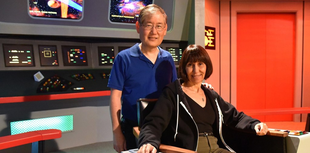
But you two are Star Trek fans yourself, so you do understand why we fans want to talk to you?
Michael: I am still bemused because we are not Matt Jefferies. Matt was singular, he was a visionary. We did our best to follow in that tradition.
Denise: People know that we are huge fans of Star Trek, especially the original series. We are so much like [all the other fans]. Fans are friends you have not met, and it is always very flattering when people want to hear what we have to say.
We tend to associate Matt with the Enterprise, but he was primarily a set designer.
Michael: That is absolutely correct. Matt was hired on The Cage as a set designer. Matt’s initial assignment was to design the bridge and the ship.
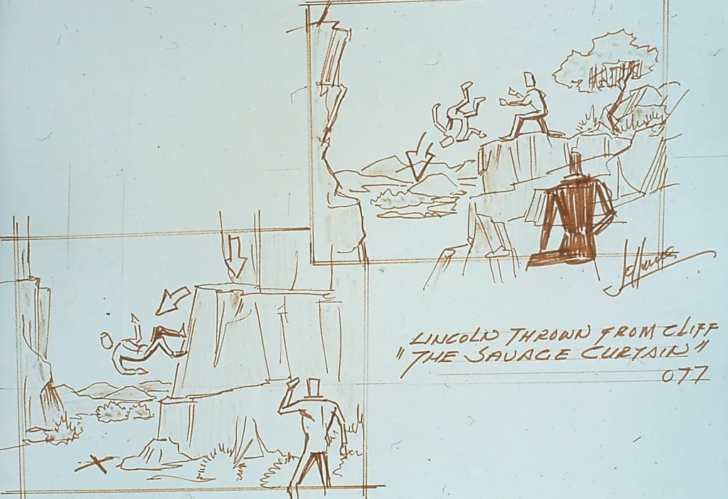
In The Savage Curtain, for example, Lincoln was originally thrown down a cliff and Matt had to design that.
Michael: Matt also filled the job of illustrator on the show. That job is not to make pretty pictures but to visualize how you are going to shoot something. Is there enough space to throw the guy? Can we reuse set pieces to do that? They are principally about problem solving, not art for art’s sake.
Has Star Trek been loyal to Matt Jefferies’ design ideas?
Michael: The job of each Star Trek project is to give itself its own identity, so by definition you are going to do something different than what Matt did. The challenge is to do that in a way that pays respect to what Matt did and not violate it egregiously.
I never asked Matt what he thought of what we did on The Next Generation. I would like to think he respected what we did.
How does Matt’s vision inform your own work?
Denise: It has to be at the forefront of our brains. We were raised on Star Trek, and we admired Matt Jefferies. Again, simplicity of design. It is with us at all times.
Michael: What she said.
Are there any other Matt stories you want to share?
Michael: Matt told us one of his favourite things to do was to hang out at the hangar at Santa Paula Airport. In the hangar was a loft, and when the original series wrapped he grabbed the two mattresses that were in Kirk and Spock’s quarters and for years when he and Mary Ann stayed there overnight they would sleep on those beds.
Denise and Michael had packed schedules at Trekonderoga and lots of people wanted to talk to them. I very much appreciate that they found time to speak with me, before they themselves headed to an airport.
Postscript
One of the few times we can see Matt Jefferies talk about his work on Star Trek is in this video of his conversation with Doug Drexler and Michael and Denise. “I wanted to record his voice,” Michael told me. “I knew Doug would bring that fabulous reference folder and I wanted to see what he was pointing at. That’s why I shot the video.”

